SHARE スタジオSKLIMによるオフィス”Thin Office”

photo©Jeremy San, images courtesy of Studio SKLIM
スタジオSKLIMが設計したシンガポールのオフィス”Thin Office”です。
以下、建築家によるテキストです。
Thin Office
@ Jalan Besar, Singapore
“Work is where you are, work has become a state of mind.”
Paola Antonelli, curator of MoMA’s dept of Architecture and Design – 2001 exhibition “Work Spheres”.
While tapping on a laptop in a cafe has become the ubiquitous platform to begin “work”, the need for a permanent work environment for any office is still necessary in the long run. Perhaps what has changed since the advent of “coffee offices” has been the increasing need for flexibility within a sedentary work sphere.
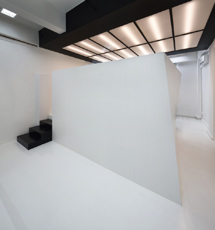
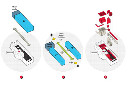
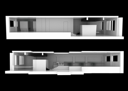
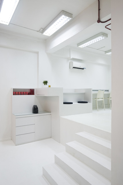
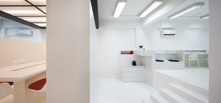
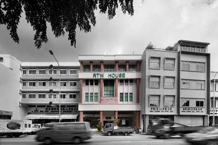
The program brief was for an office space shared by an IT company and a multi-media setup. Located in a refurbished postwar building right in Singapore’s CBD outskirts, the space was long and narrow with split levels, offering the possibility of a raised space. Existing light fixtures, ceiling and wall conditions were left unaltered as much as possible.
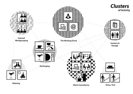
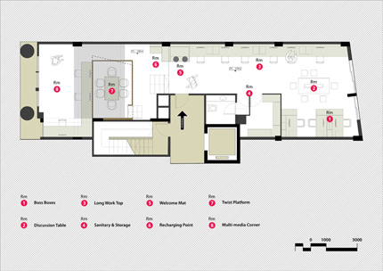
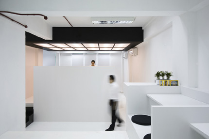
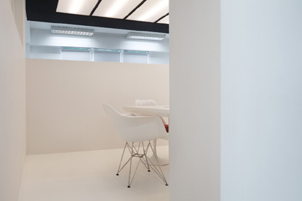
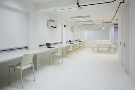
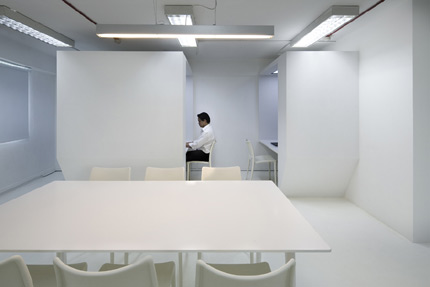
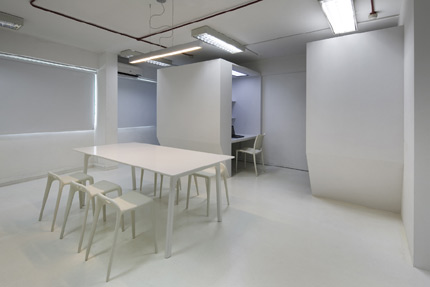
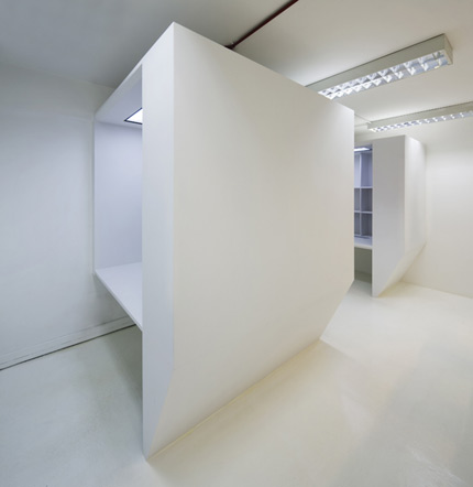
The designed space was to reflect the ethos of the companies: Flexibility, Technology and Creativity. The office space was loosely organised into 8 clusters namely: the Boss Boxes, Long Work Top , Discussion Table, Welcome Mat, Sanitary & Storage, Recharging Point, Twist Platform and Multi-media Corner. Each of these clusters were arranged around an open plan configuration with the exception of Sanitary & Storage to allow a multifarious overlap of working trajectories.
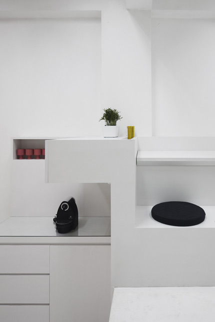
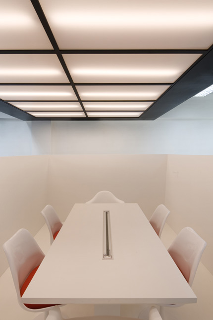
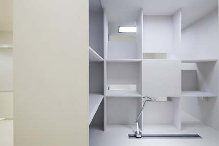
The flexible working environment was kept in mind with the possibility of hot desking, informal working clusters and also semi-private cubicles. The Boss Boxes were an option for more privacy as some work required a certain level of seclusion. Technology is a crucial aspect of any modern day office and the ease of being “connected” to either an internet network or a power source was one of the concerns of the client. The fluctuating size of the workforce also meant flexible working spaces which could be contracted and expanded to fit the demands of this office. The result was the “Long Work Top” which incorporated an ingenious power strip of data points, power supply and telecommunication points to be accessible at any location along this table, expanding the number of workstations from 6 to 10 in a few minutes. This single piece of stretched work surface became part of a greater string of furniture transforming from table top, reception seating, storage and finally to pantry space.
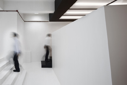
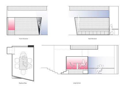
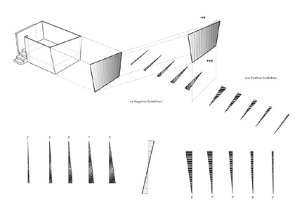
The Twist Platform was a raised meeting pod that capitalised on the higher ceiling to incorporate storage beneath. Sightlines, privacy and anthropometrics were important aspects to the final geometric configuration of this space. The Twist Platform thus provided the backdrop to an office party at the Recharging Point and provided privacy to the independent operation of the multi-media setup. The giant overhead light fixture was a final touch to the suggestion of this event space.
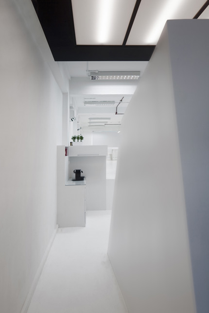
The essence of this “Thin Office” was a desire to remain anonymous and to provide a blank canvas for various work scenarios and possibilities. This “thinness” was translated from the basic organisation of spaces which opened up a central thoroughfare for circulation, light and natural ventilation, through to the furniture details which celebrated the geometrical state of being folded, suspended or twisted.
Facts & Figures
Client:Kido Technologies
Design Team:Kevin Lim
Main Photography:Copyright – Jeremy San, images courtesy of Studio SKLIM
Illustrations:Copyright Studio SKLIM
Gross Floor area:120m2

