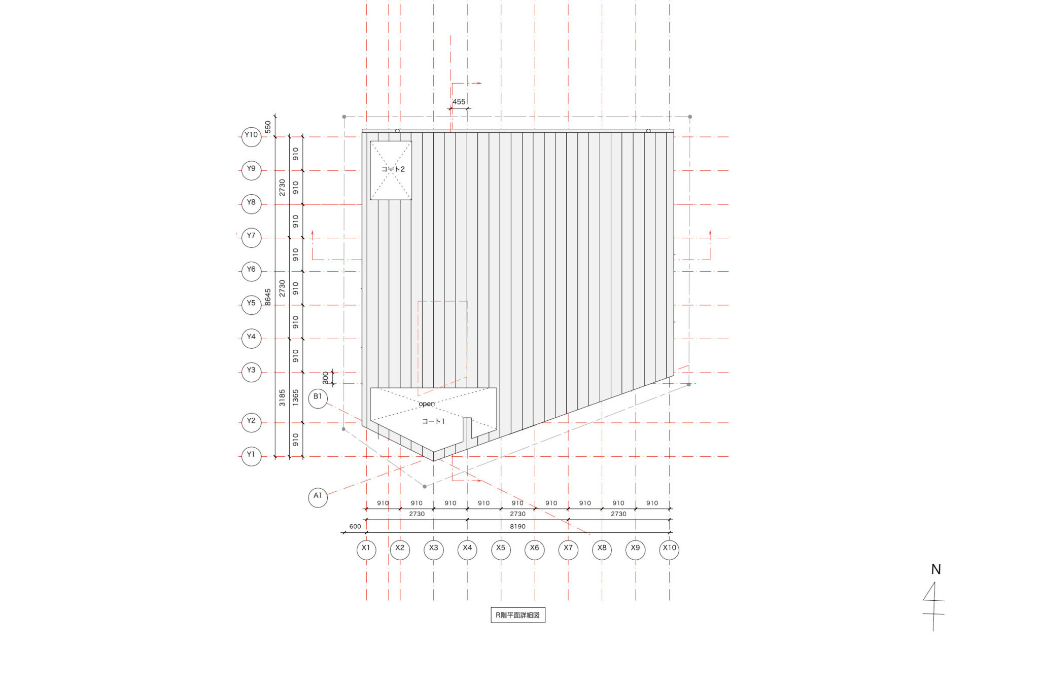
SHARE 阿曽芙実建築設計事務所による、大阪の住宅「13pieces」。方向の把握もしにくい“変則五角形”の角地。特殊な条件に対応する為、全ての面に対して“同じ接し方で解く”姿勢での計画を志向。敷地の境界線をなぞった外形の平面を“9つのマス”に分割して設計のベースとする
阿曽芙実建築設計事務所が設計した、大阪の住宅「13pieces」です。
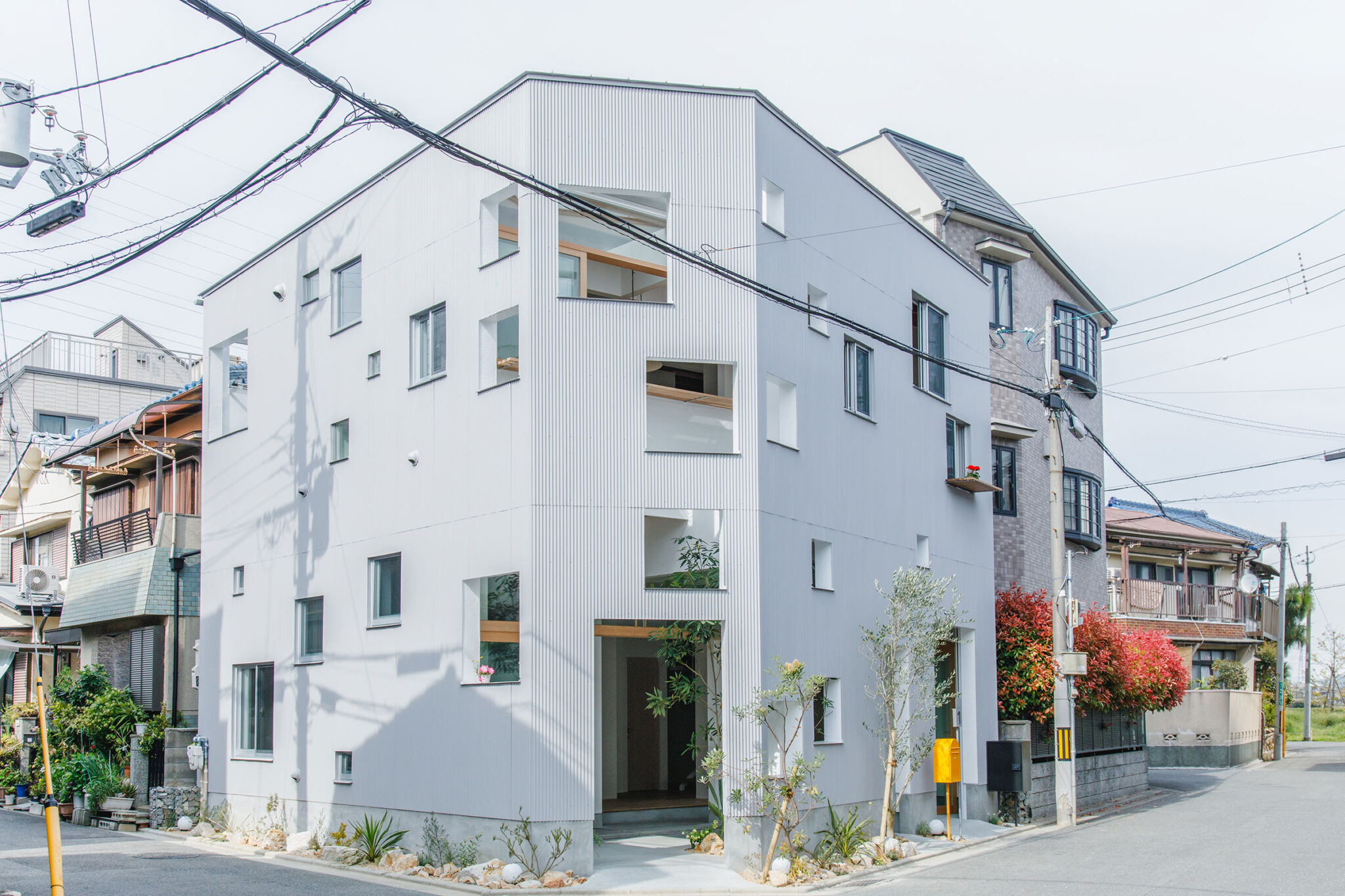
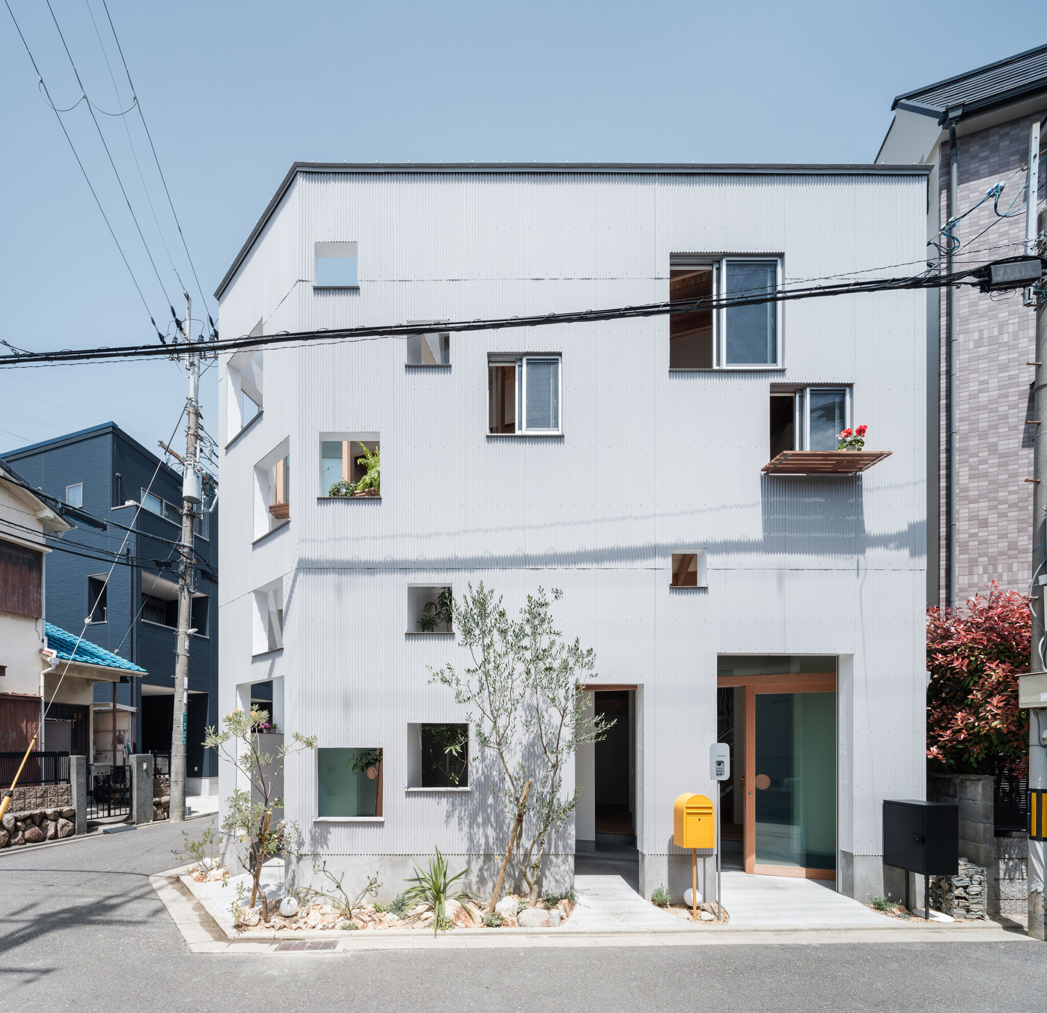
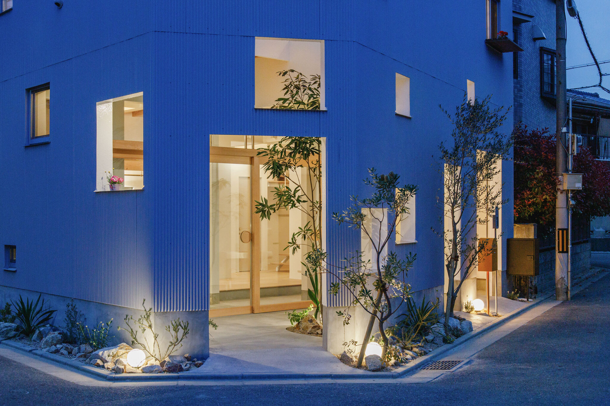
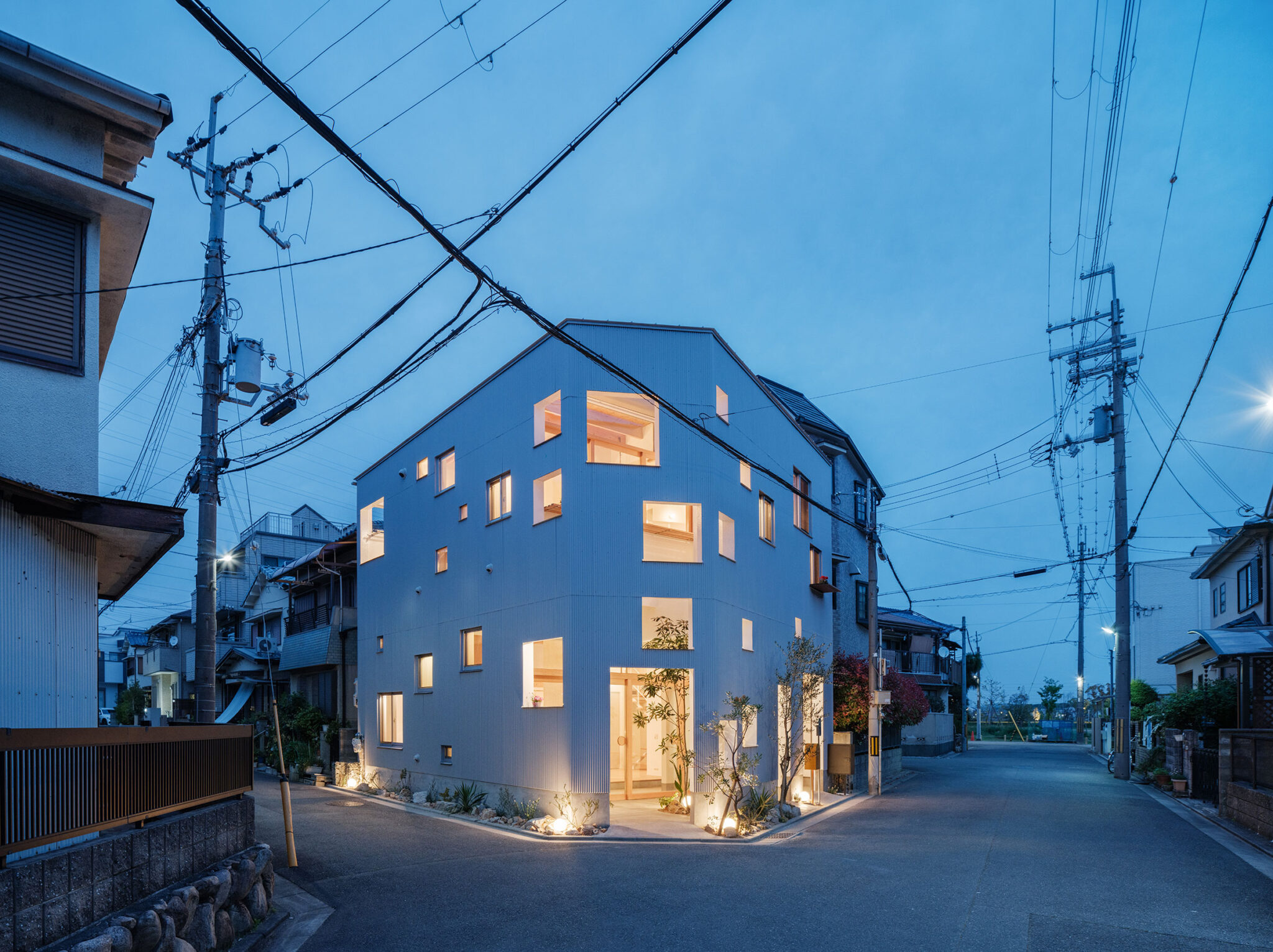
方向の把握もしにくい“変則五角形”の角地です。建築家は、特殊な条件に対応する為、全ての面に対して“同じ接し方で解く”姿勢での計画を志向しました。そして、敷地の境界線をなぞった外形の平面を“9つのマス”に分割して設計のベースとしました。
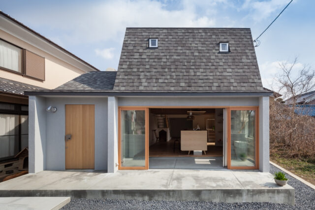
敷地周辺は、南北をJRと私鉄、東西に巨大遺跡公園や幹線道路があり、都市のインフラに切り取られた住宅地の一角で、小振りの住宅が綺麗に並んだ角地にある。
町並みはあまり特徴がなく、どこにでもありそうな風景だ。利便性がいい場所柄もあり、建て替えによる世代交代が進み、車庫がなかった2階建ての住宅地から車庫あり3階建ての住宅地に風景を変えようとしている。それはつまり、車庫をつくることで1階の前庭が無くなり、3階になることで建物のボリュームが増す。
このような場所に、新たに車庫なし2階建てを計画する。敷地が変則5角形だったり、角地で2面開いていたりと方向性を特定しにくい敷地の特性から、どの面に対しても同じ接し方で解いていくことにした。
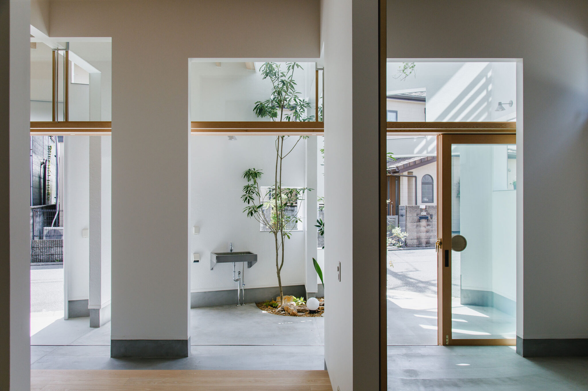
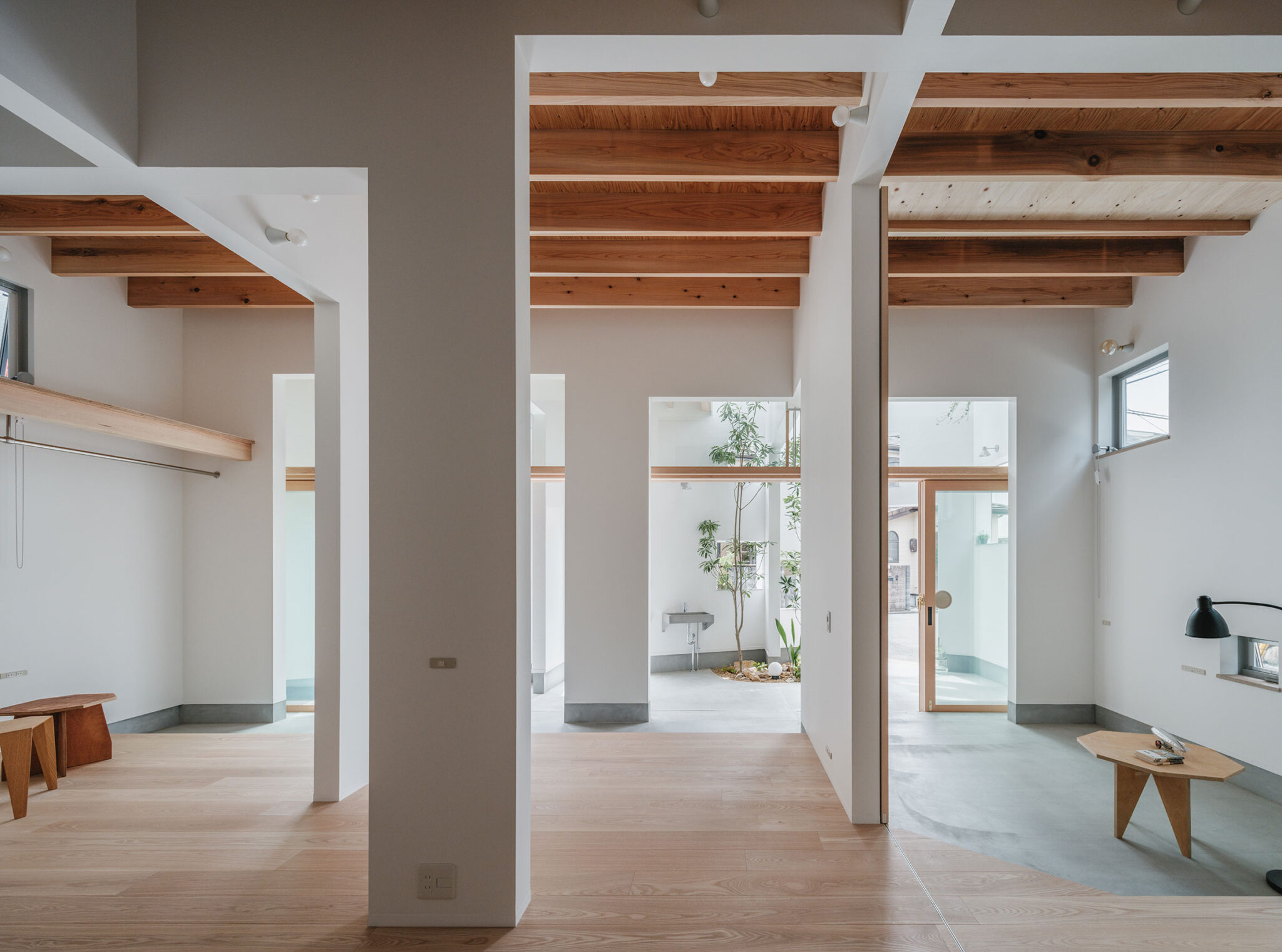
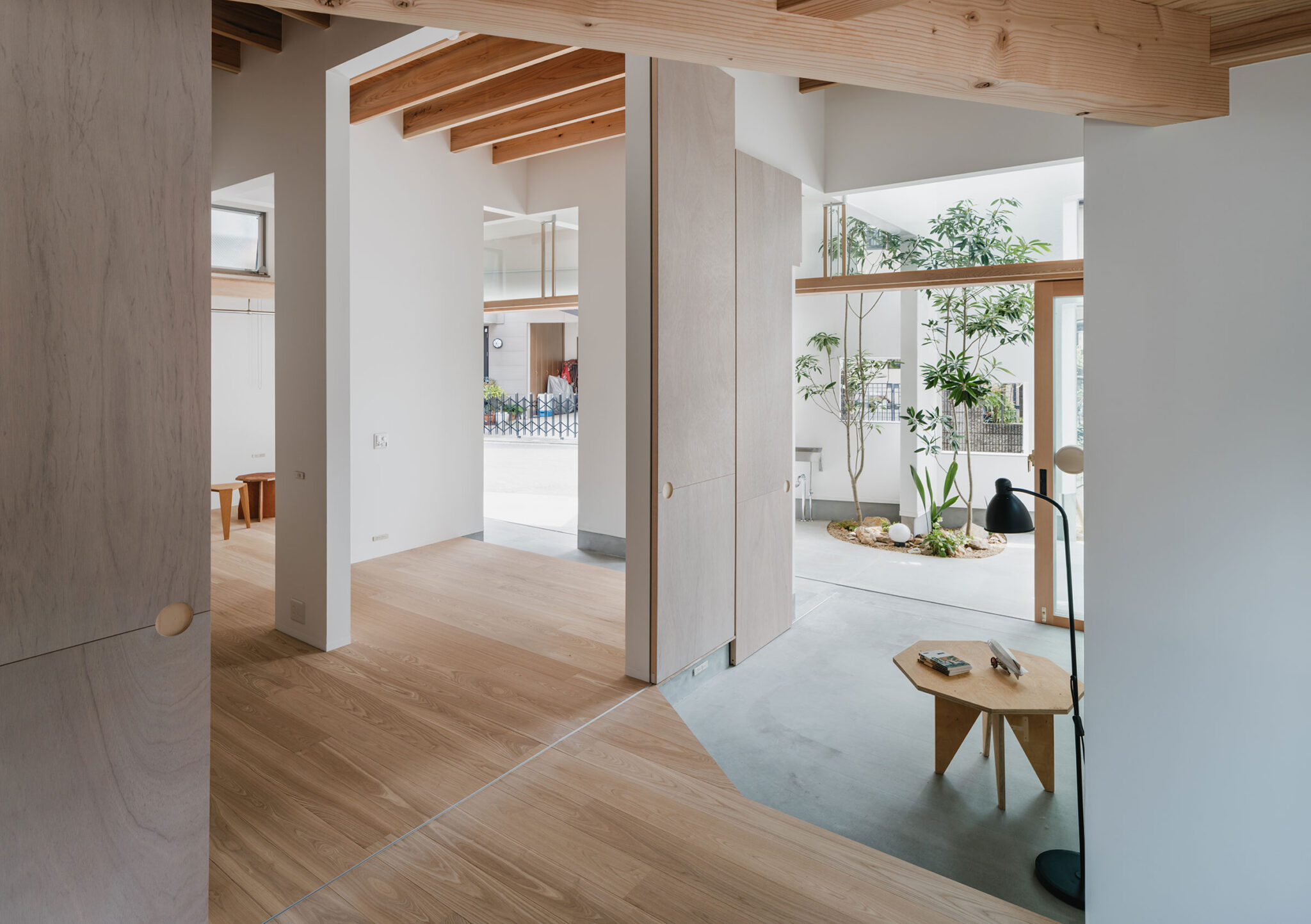
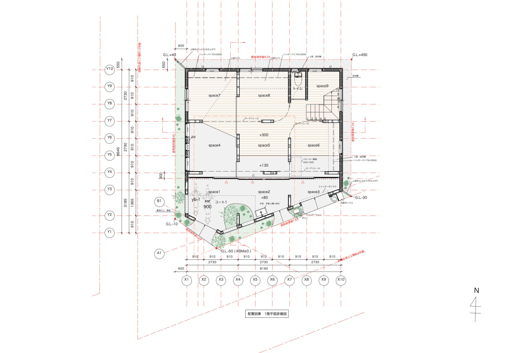
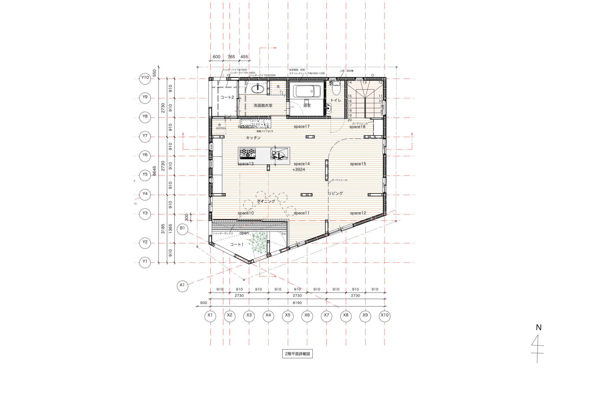
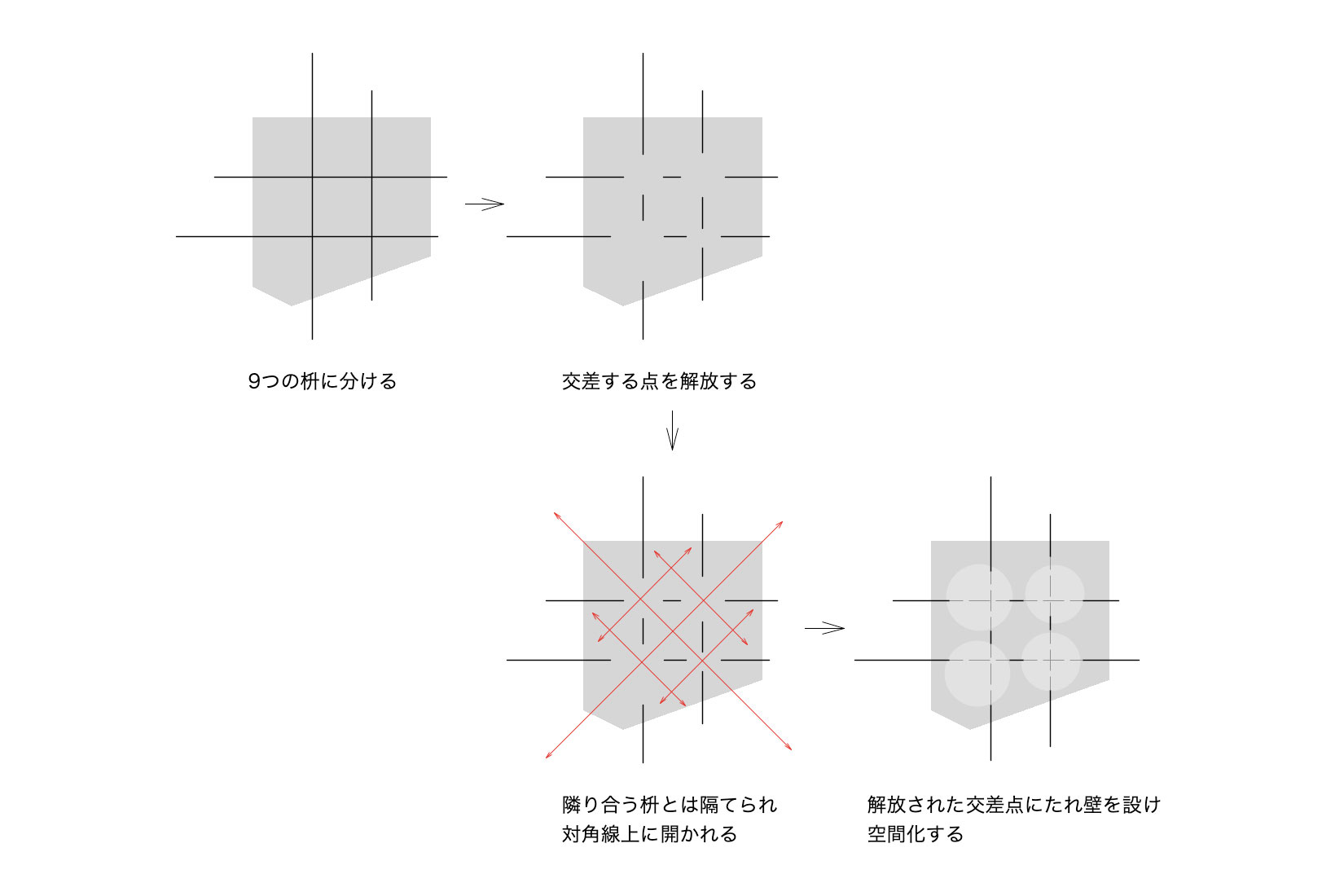
まず、敷地境界線からひと回り小さい線で囲いとり、9つの枡に分けた。
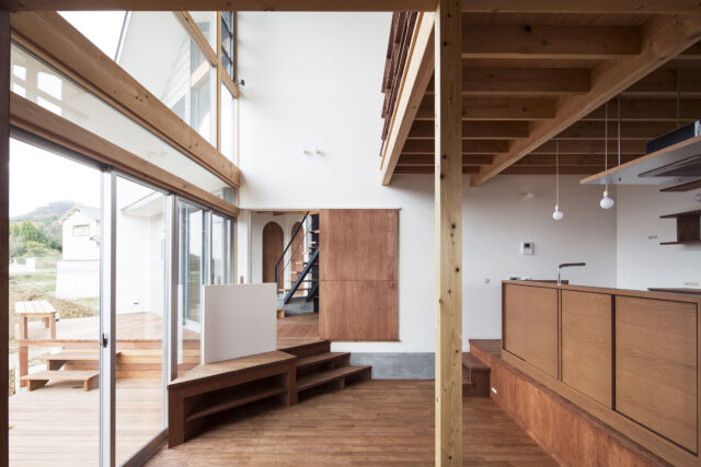
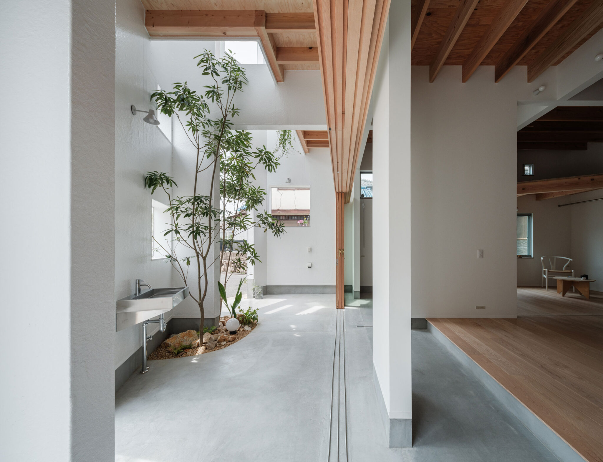
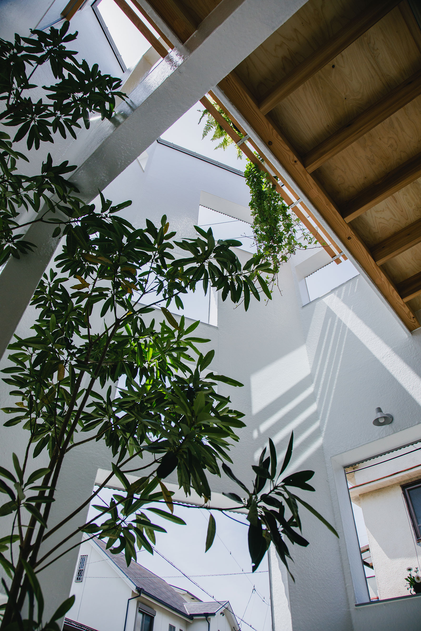
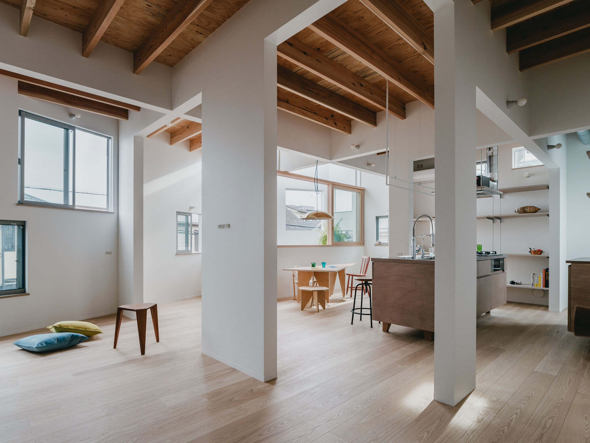
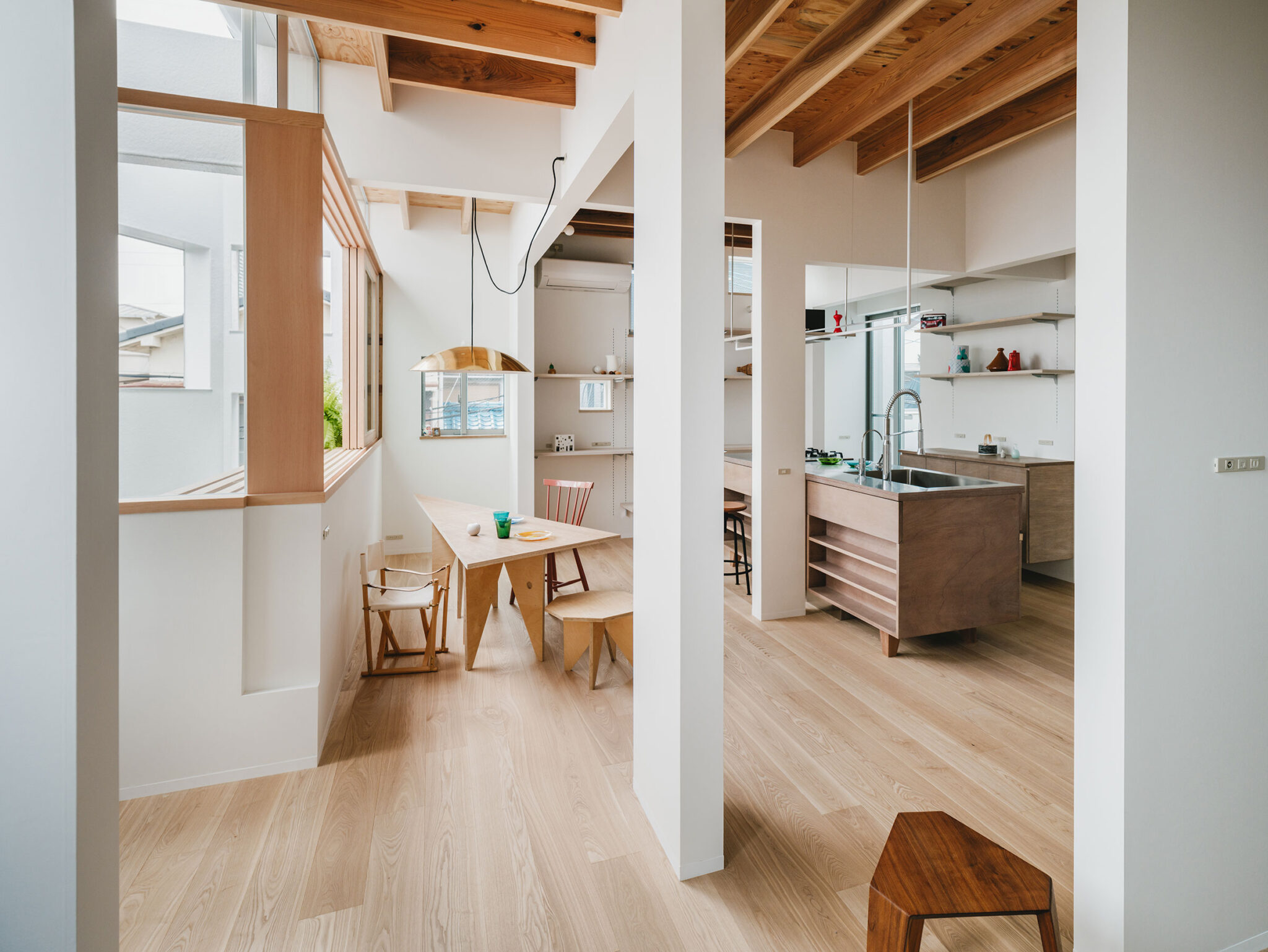
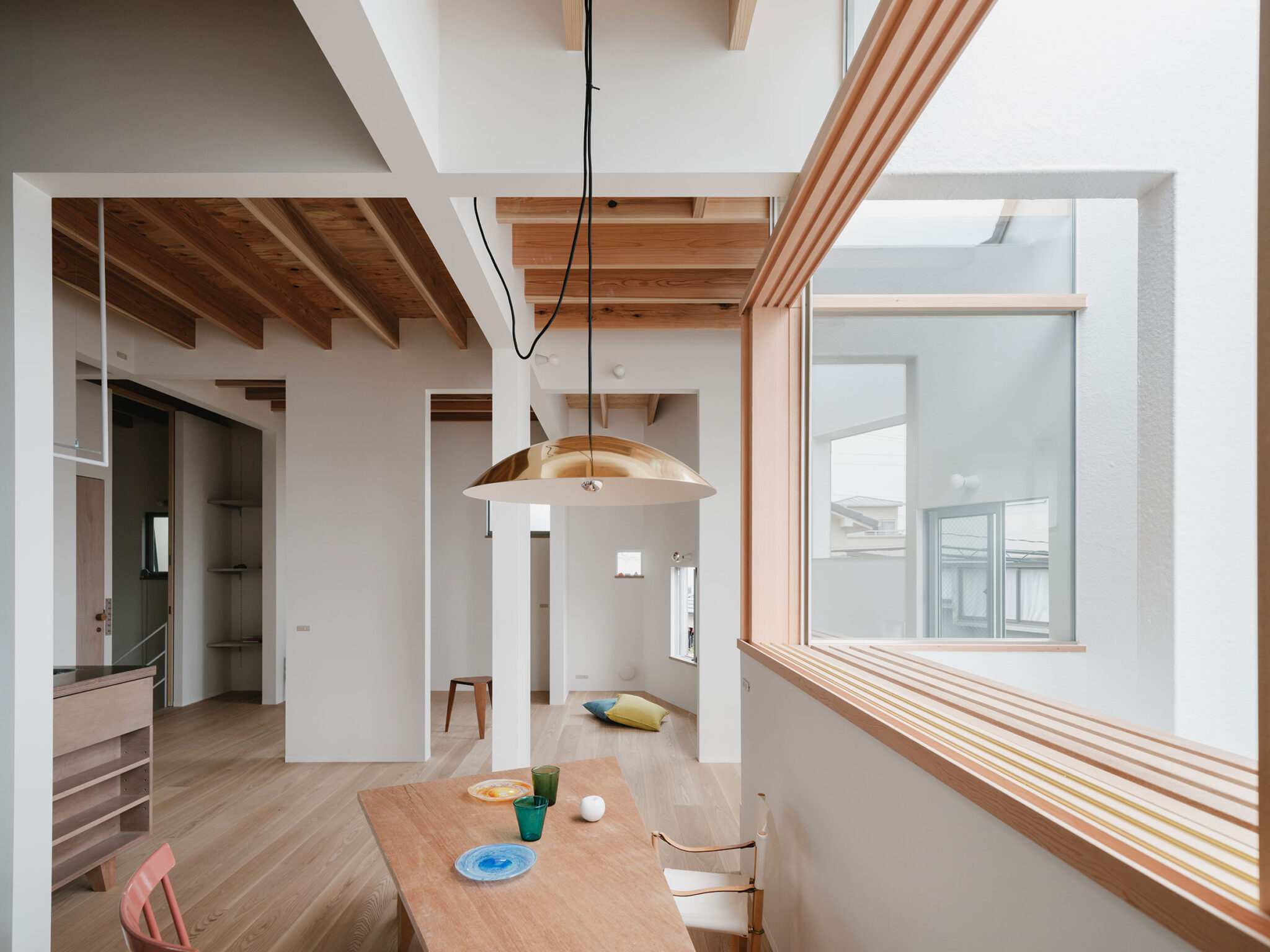
9つに分けることで、各方角の5面に対して対等に建った。9つの枡の交差する点を開き、交差しない線を閉じた。すると、隣り合う枡は距離をとり、斜めの枡とは視線が抜け共鳴し合い、9つの枡と交差する4つのエリアが生まれる。交差するたれ壁の高さを揃え、それぞれの交差点のたれ壁の高さを変えることで、空間の質を変化させた。
以下の写真はクリックで拡大します
以下、建築家によるテキストです。
内と内、内と外、開口でつくる距離感
敷地周辺は、南北をJRと私鉄、東西に巨大遺跡公園や幹線道路があり、都市のインフラに切り取られた住宅地の一角で、小降りの住宅が綺麗に並んだ角地にある。
町並みはあまり特徴がなく、どこにでもありそうな風景だ。利便性がいい場所柄もあり、建て替えによる世代交代が進み、車庫がなかった2階建ての住宅地から車庫あり3階建ての住宅地に風景を変えようとしている。それはつまり、車庫をつくることで1階の前庭が無くなり、3階になることで建物のボリュームが増す。
このような場所に、新たに車庫なし2階建てを計画する。敷地が変則5角形だったり、角地で2面開いていたりと方向性を特定しにくい敷地の特性から、どの面に対しても同じ接し方で解いていくことにした。
まず、敷地境界線からひと回り小さい線で囲いとり、9つの枡に分けた。
9つに分けることで、各方角の5面に対して対等に建った。9つの枡の交差する点を開き、交差しない線を閉じた。すると、隣り合う枡は距離をとり、斜めの枡とは視線が抜け共鳴し合い、9つの枡と交差する4つのエリアが生まれる。交差するたれ壁の高さを揃え、それぞれの交差点のたれ壁の高さを変えることで、空間の質を変化させた。
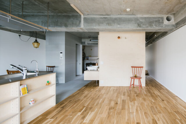
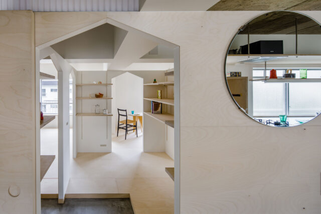
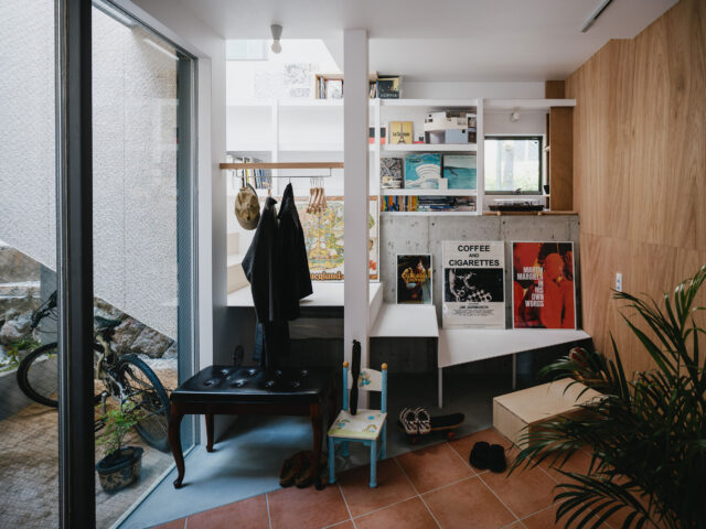
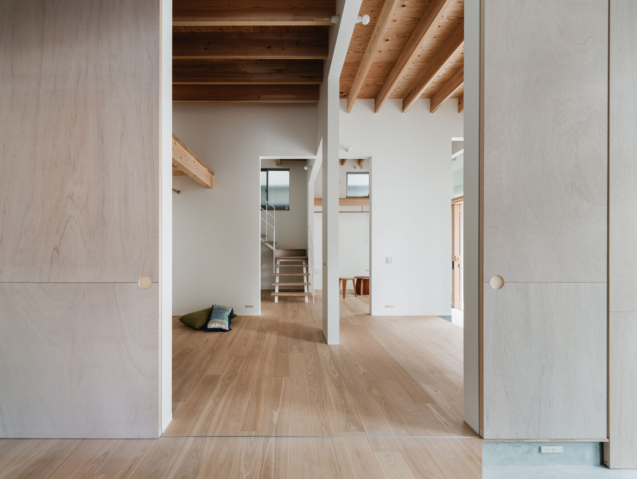
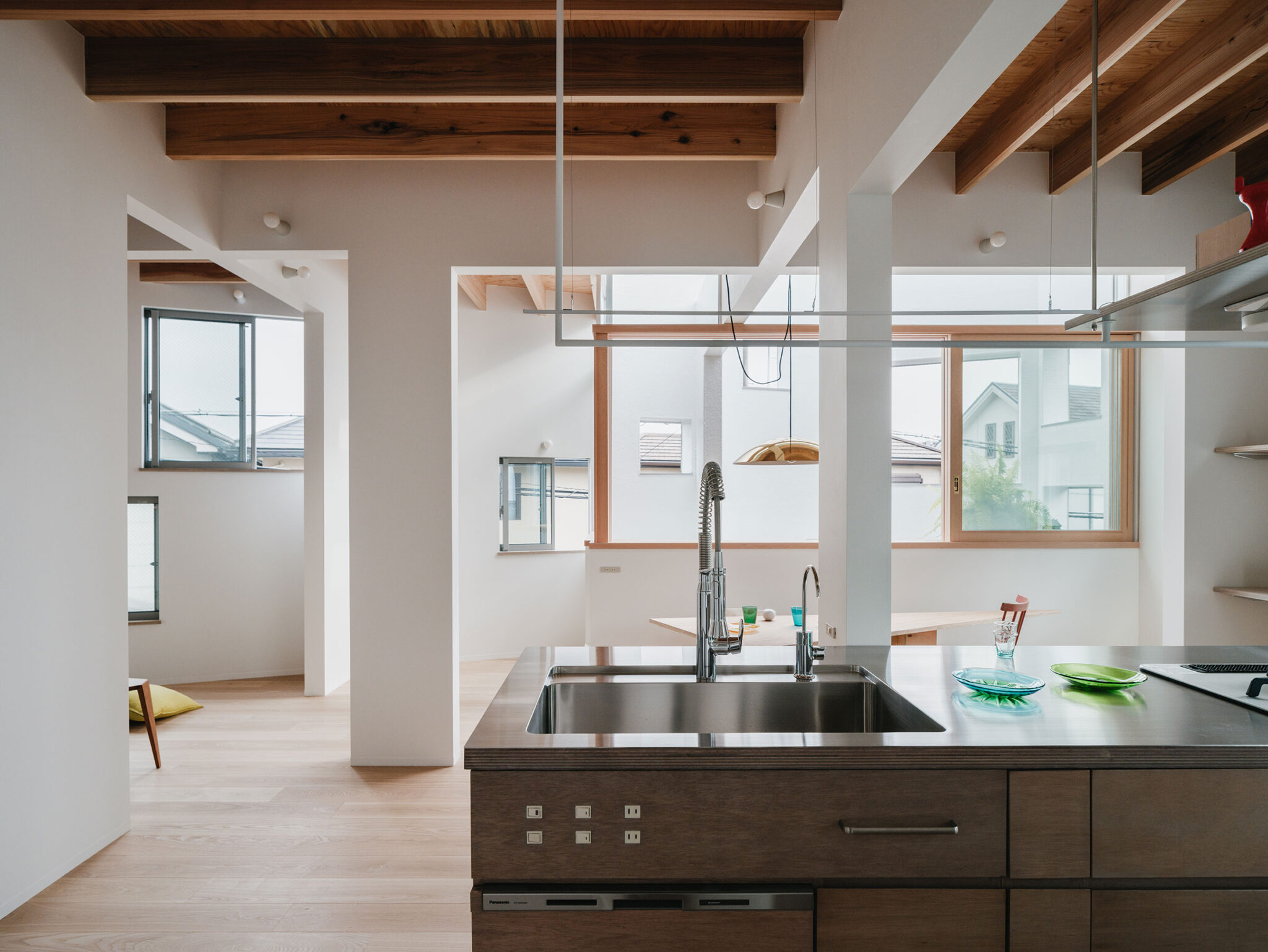
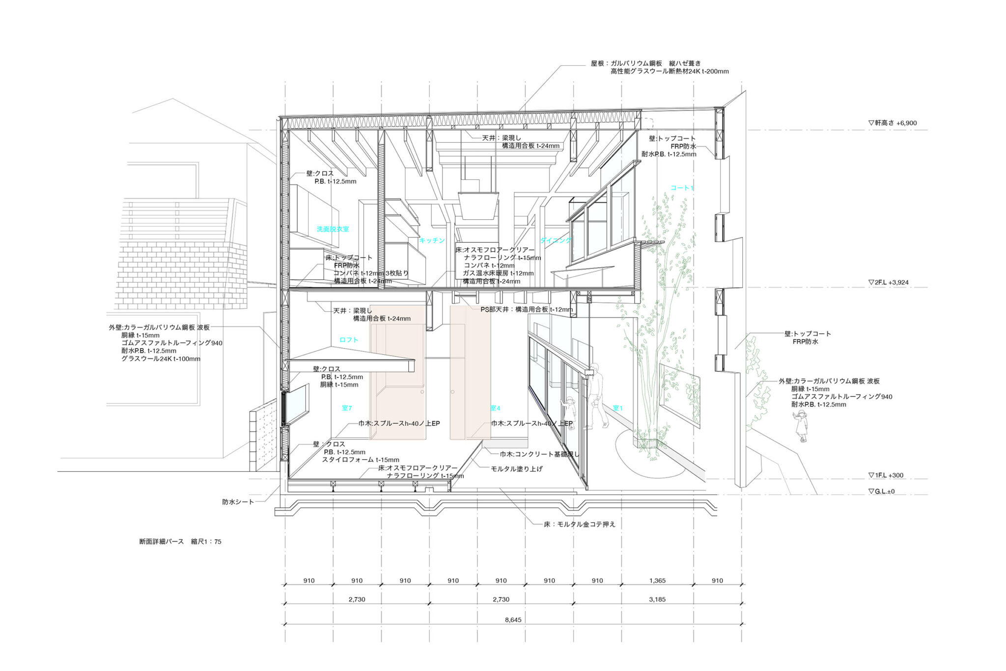
1階のspace6や8、2階のspace15のように壁で隔てられた枡を前提に空間をつくりとったり、枡の交差点でたれ壁によって緩やかに囲われたエリア、例えば、1階のspace5からspace9への移動空間(階段を上がり口)や2階のキッチンやダイニングのように生活空間を獲得したりと、それぞれの場所を使い分けた。暮らしの中で移動しながら視線の位置が変化すると、空間の捉え方が変化し、つながったり途切れたりする。
町との接続部分に関しては、緑を枡の中に取り込み、レイヤーをかけることで前庭を内部に引き込み、天井を高くすることで建物全体としては、2.5階建て程度の高さとした。各方角に対しては、近隣の細やかな特徴を拾いながら開口の位置や大きさで形成しながら窓を散りばめることで、外観からの階数や方角に対するリテラシーを一掃した。これにより、車庫なし前庭ありの2階建ての景色と、前庭なしの3階建ての町並みとの合間を図った景色を窓によって可能にした。
(阿曽芙実)
■建築概要
題名:13pieces
所在地:大阪府
主用途:専用住宅
設計:阿曽芙実建築設計事務所 担当/阿曽芙実
施工:大垣林業株式会社
構造:木造
階数:地上2階
敷地面積:81.93㎡
建築面積:53.95㎡
延床面積:93.64㎡
設計:2023年4月~2023年10月
工事:2023年10月~2024年3月
竣工:2024年3月
写真:yousuke ohtake
| 種別 | 使用箇所 | 商品名(メーカー名) |
|---|---|---|
| 外装・屋根 | 屋根 | ガルバリウム鋼板嵌合葺き |
| 外装・壁 | 外壁 | ガルバリウム鋼板t-0.4 小波 |
| 内装・床 | 土間 | 土間コンクリート |
| 内装・床 | 内部 床 | フローリング |
| 内装・壁 | 内部 壁 | クロス |
| 内装・天井 | 内部 天井 | 構造用合板 梁 根太 現し |
※企業様による建材情報についてのご意見や「PR」のご相談はこちらから
※この情報は弊サイトや設計者が建材の性能等を保証するものではありません
Inside and inside, inside and outside, creating distance through openings
The site is surrounded by JR and private railways to the north and south, a huge ruins park and main roads to the east and west, and is a corner of a residential area cut off by urban infrastructure, with small houses neatly lined up. The streetscape is not particularly distinctive, and it looks like something you could find anywhere. Due to the convenient location, the area is undergoing a generational change through rebuilding, and they are trying to change the landscape from a two-story residential area without garages to a three-story residential area with garages. In other words, by creating a garage, the front yard on the first floor will be eliminated, and the third floor will increase the volume of the building.
A new two-story building without a garage is planned for this location. Due to the characteristics of the site, which is an irregular pentagon and has two open sides on a corner, making it difficult to pinpoint the direction, we decided to solve the problem in the same way on all sides.
First, we drew a line one size smaller than the site boundary line and divided it into nine squares. By dividing it into nine, the building was built equally on all five sides in each direction. The intersections of the nine squares were opened, and the lines that did not intersect were closed. Then, the adjacent squares were spaced apart, and the lines of sight were clear of the diagonal squares, resonating with each other, creating four areas that intersect with the nine squares. The quality of the space was changed by aligning the height of the intersecting hanging walls and changing the height of the hanging walls at each intersection.
Spaces were created based on the premise that the squares are separated by walls, such as space 6 and 8 on the first floor and space 15 on the second floor, and areas gently enclosed by hanging walls at the intersections of the squares, such as the transition space from space 5 to space 9 on the first floor (the entrance at the top of the stairs) and the kitchen and dining room on the second floor, providing living space. When the position of the line of sight changes as you move around in your daily life, the way you perceive the space changes, and it is connected or disconnected.
As for the connection to the town, greenery was brought into the squares, and the front garden was pulled in by layering, and the ceiling was raised, making the overall building about 2.5 stories tall. For each direction, the windows are scattered around, taking into account the subtle characteristics of the neighborhood and shaping the opening positions and sizes, eliminating any sense of literacy regarding floor numbers and directions from the exterior. This allows the windows to create a view that blends between the two-story building with no garage and a front yard and the three-story building with no front yard. (FUMI ASO)