SHARE AMO / OMAによる展覧会「DIAGRAMS」。ヴェネツィアのプラダ財団で開催。ダイアグラムを“グラフィック装置および思考体系”として捉え、“知識の構造”や“我々の世界の理解”への貢献について考察。12世紀から現代までの300点以上の資料を展示
AMO / OMAによる展覧会「DIAGRAMS: A PROJECT BY AMO/OMA」です
ヴェネツィアのプラダ財団で開催されています。ダイアグラムを“グラフィック装置および思考体系”として捉え、“知識の構造”や“我々の世界の理解”への貢献について考察します。また、12世紀から現代までの300点以上の資料を展示しています。会期は2025年11月24日まで。展覧会の公式ページはこちら。また、展覧会の書籍も出版されています。(amazon)
こちらはリリーステキストの翻訳です(文責:アーキテクチャーフォト)
DIAGRAMS: A PROJECT BY AMO/OMA
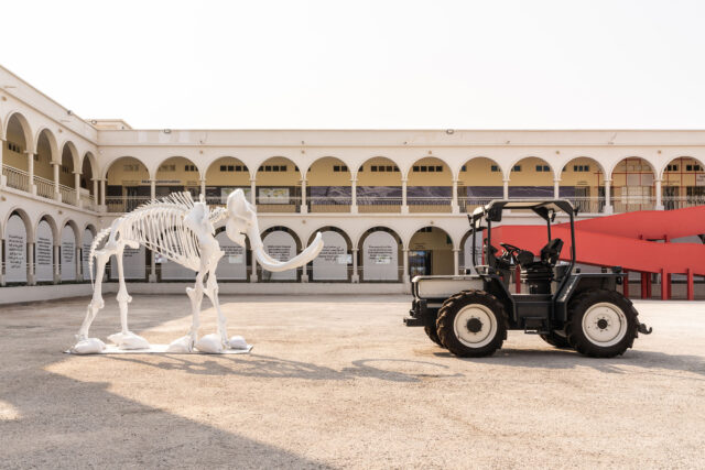
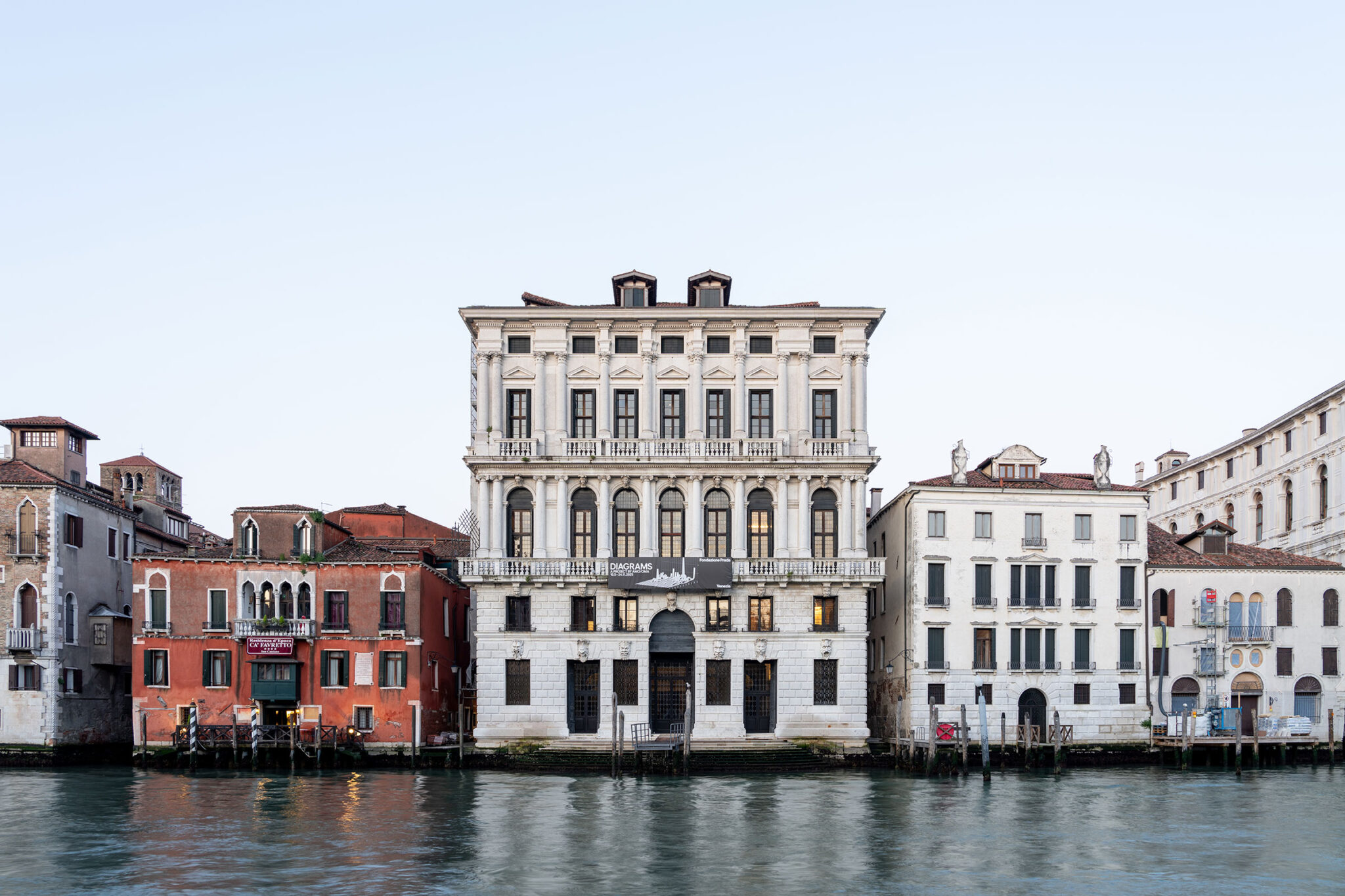
DIAGRAMS: A PROJECT BY AMO/OMA、2025年5月7日、ヴェネツィア - プラダ財団は、レム・コールハースが設立したスタジオ AMO/OMA によって構想された展覧会プロジェクト「Diagrams」を、2025年5月10日から11月24日まで、ヴェネツィアにある会場カ・コルネール・デッラ・レジーナにて開催します。
「Diagrams」は、意味を構築し、理解し、あるいは操作するための強力な手段として、また周囲の世界を分析し、理解し、変容させるための広範な手段として、データの視覚的コミュニケーションを探究します。それは、人間の知性、科学的および文化的現象、そして知識の創造と伝達との関係についての対話と思索的な考察を促すことを目的としています。
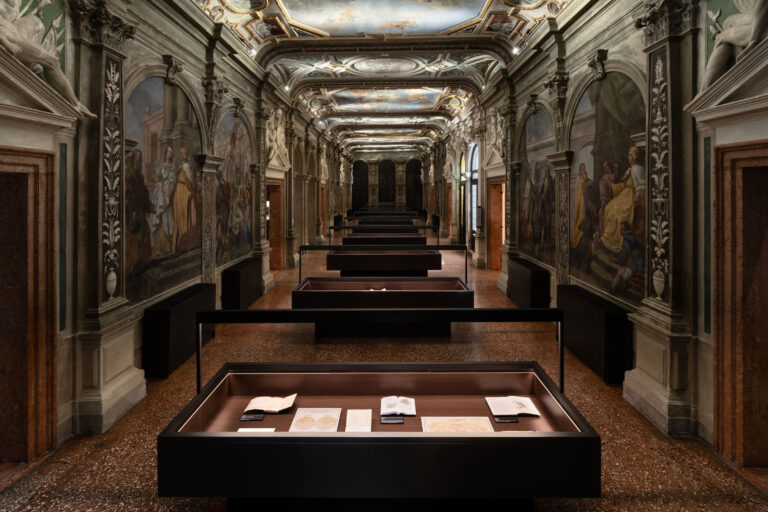
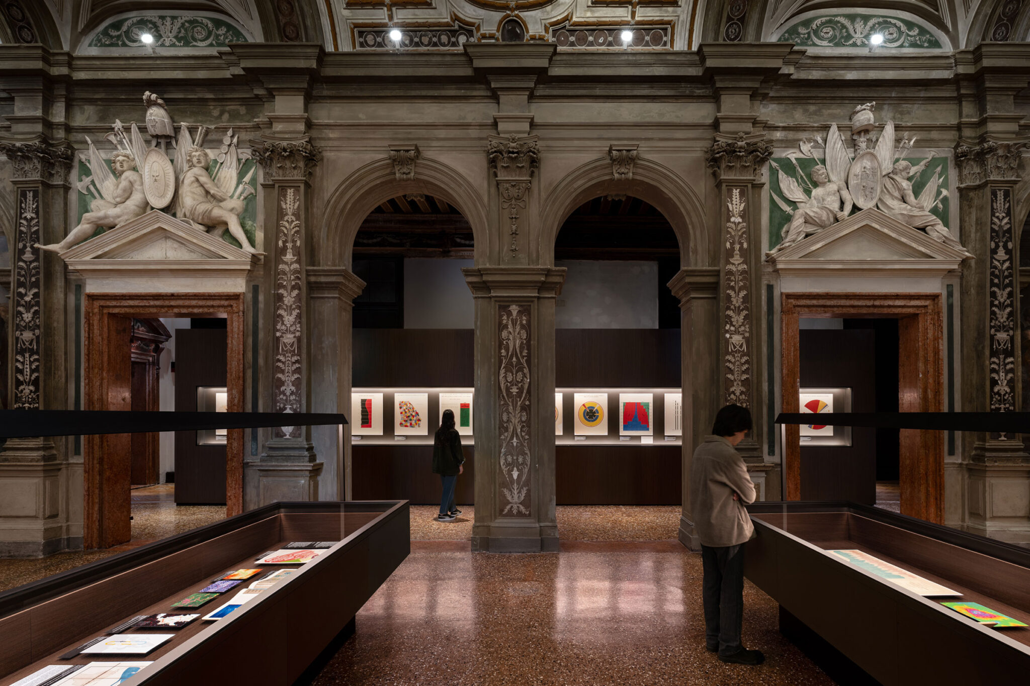
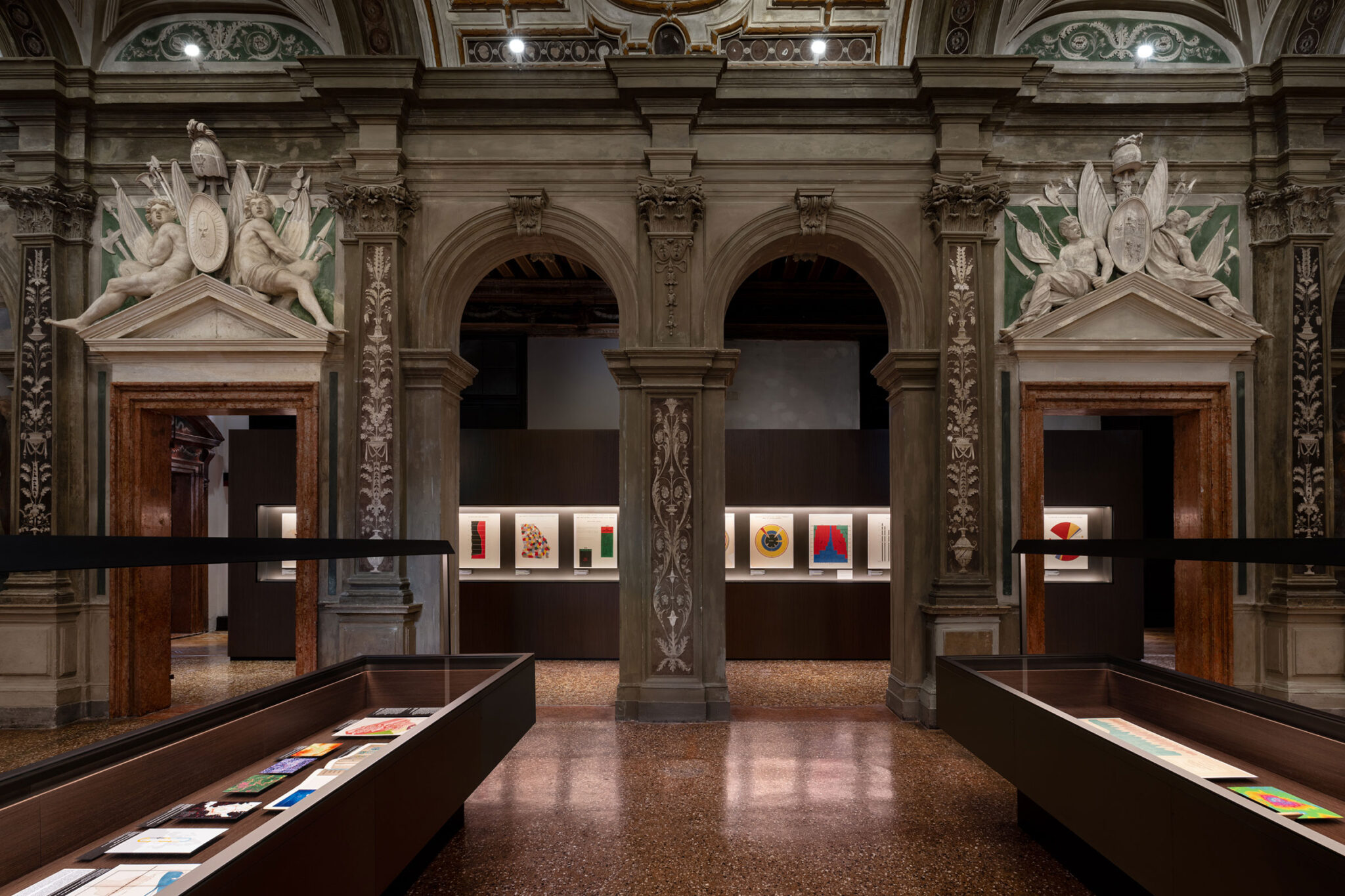
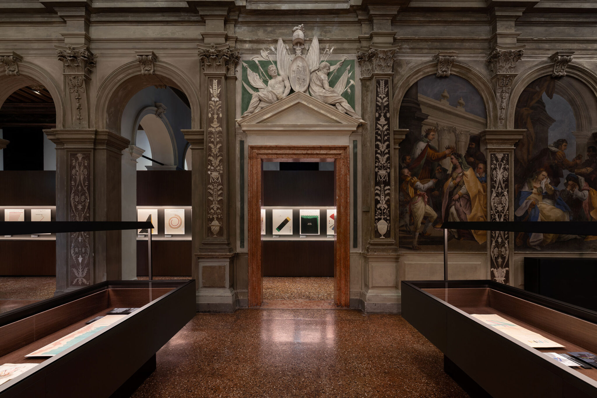
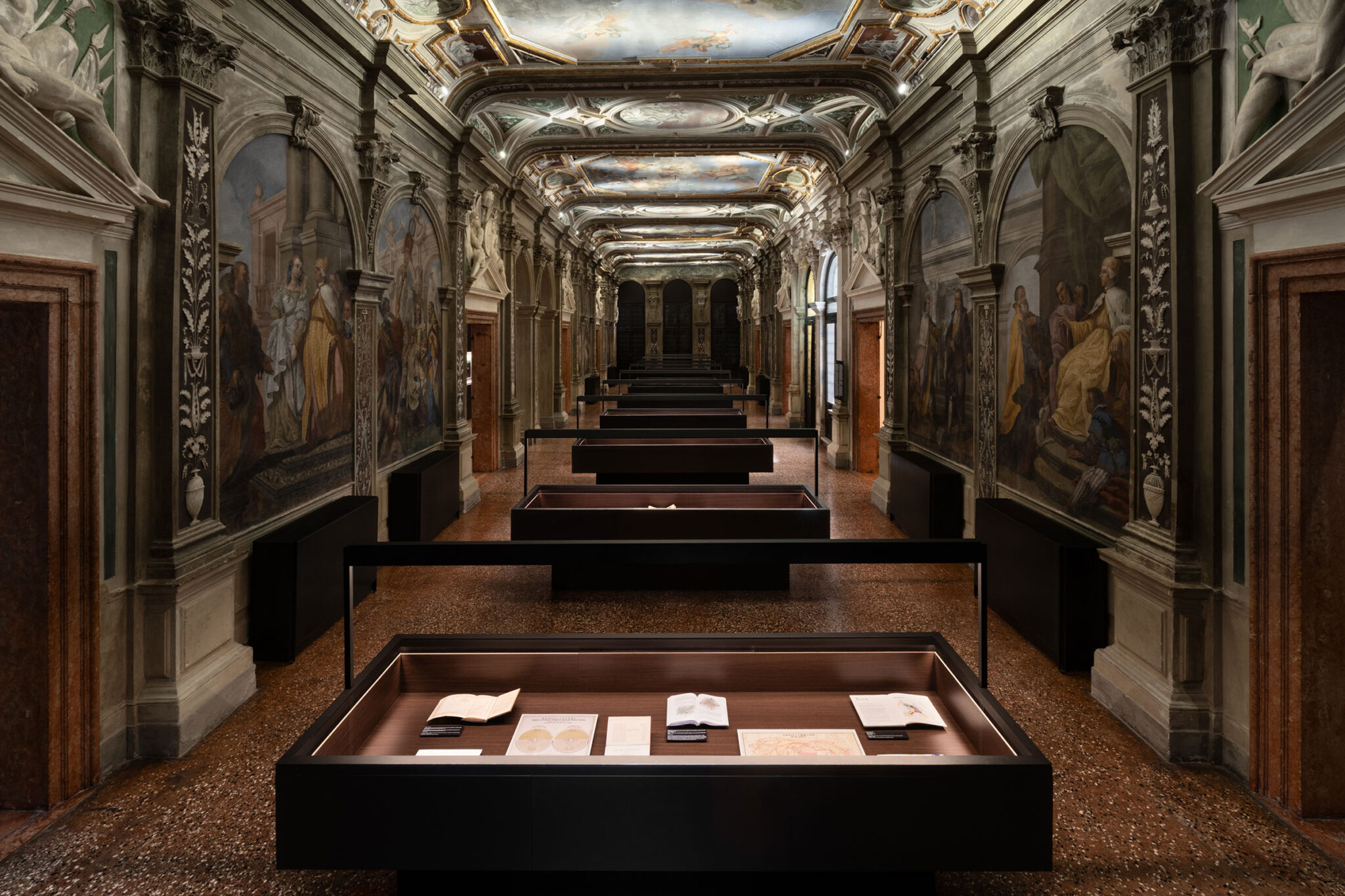
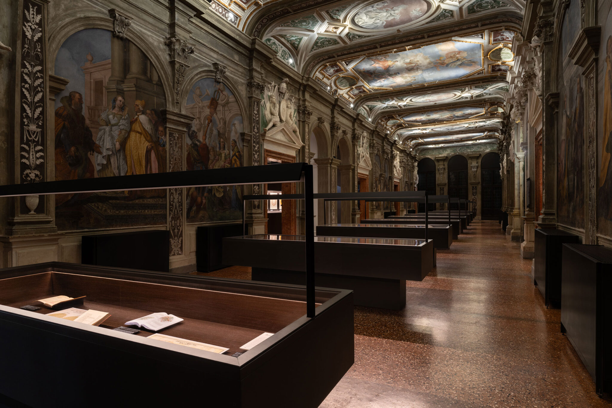
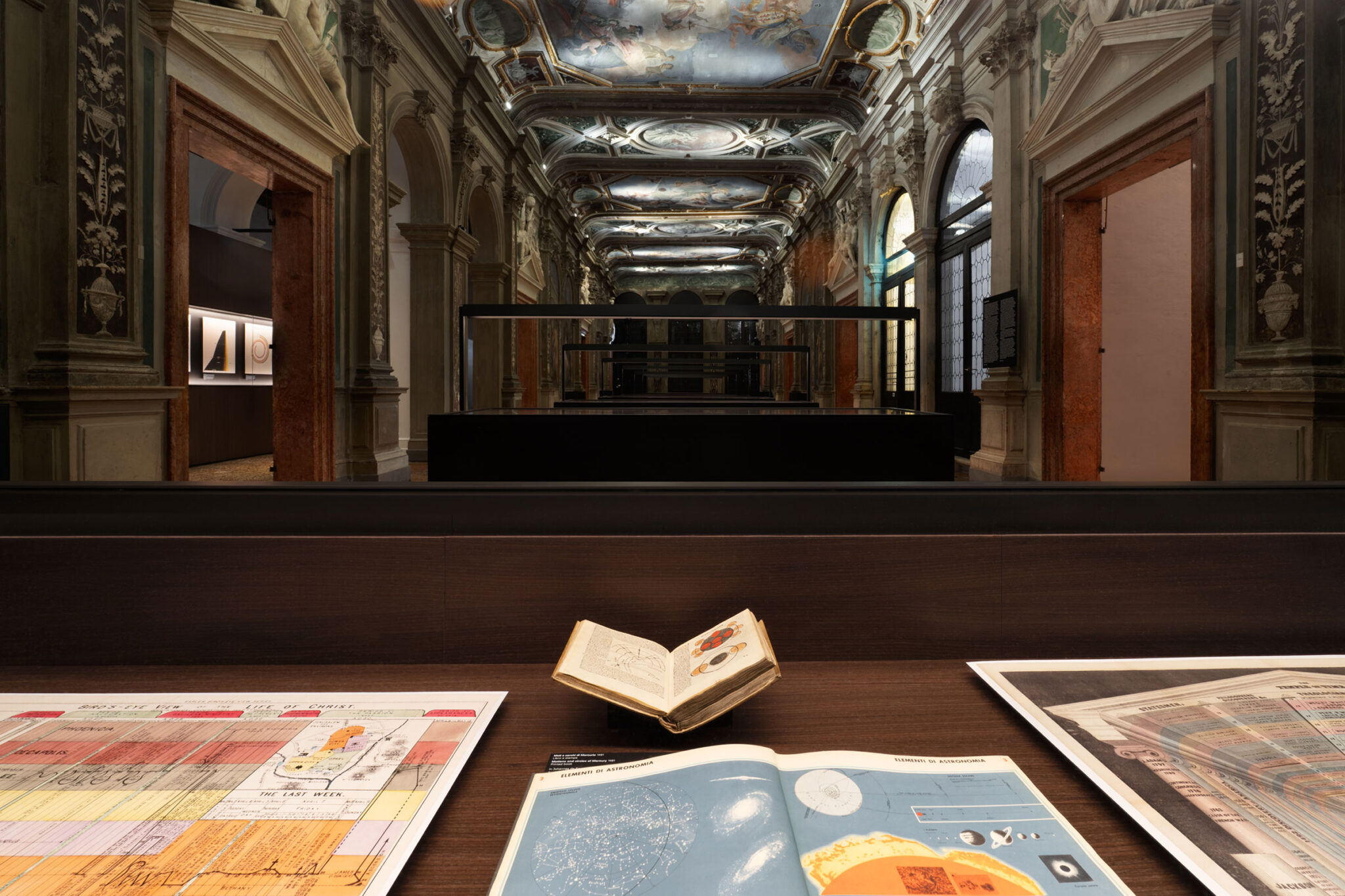
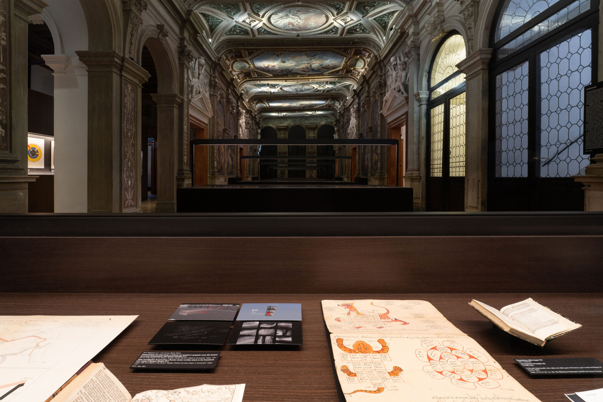
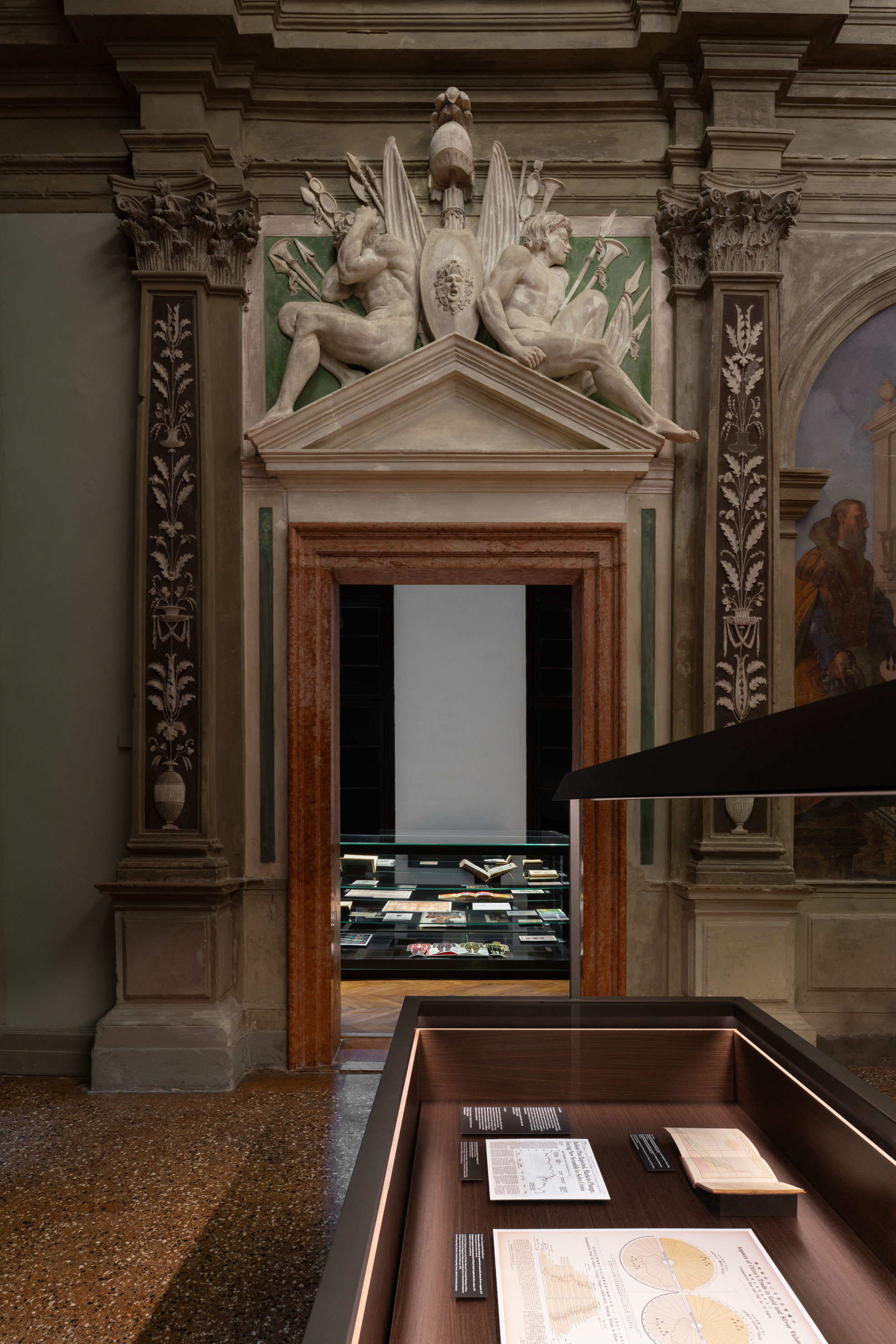
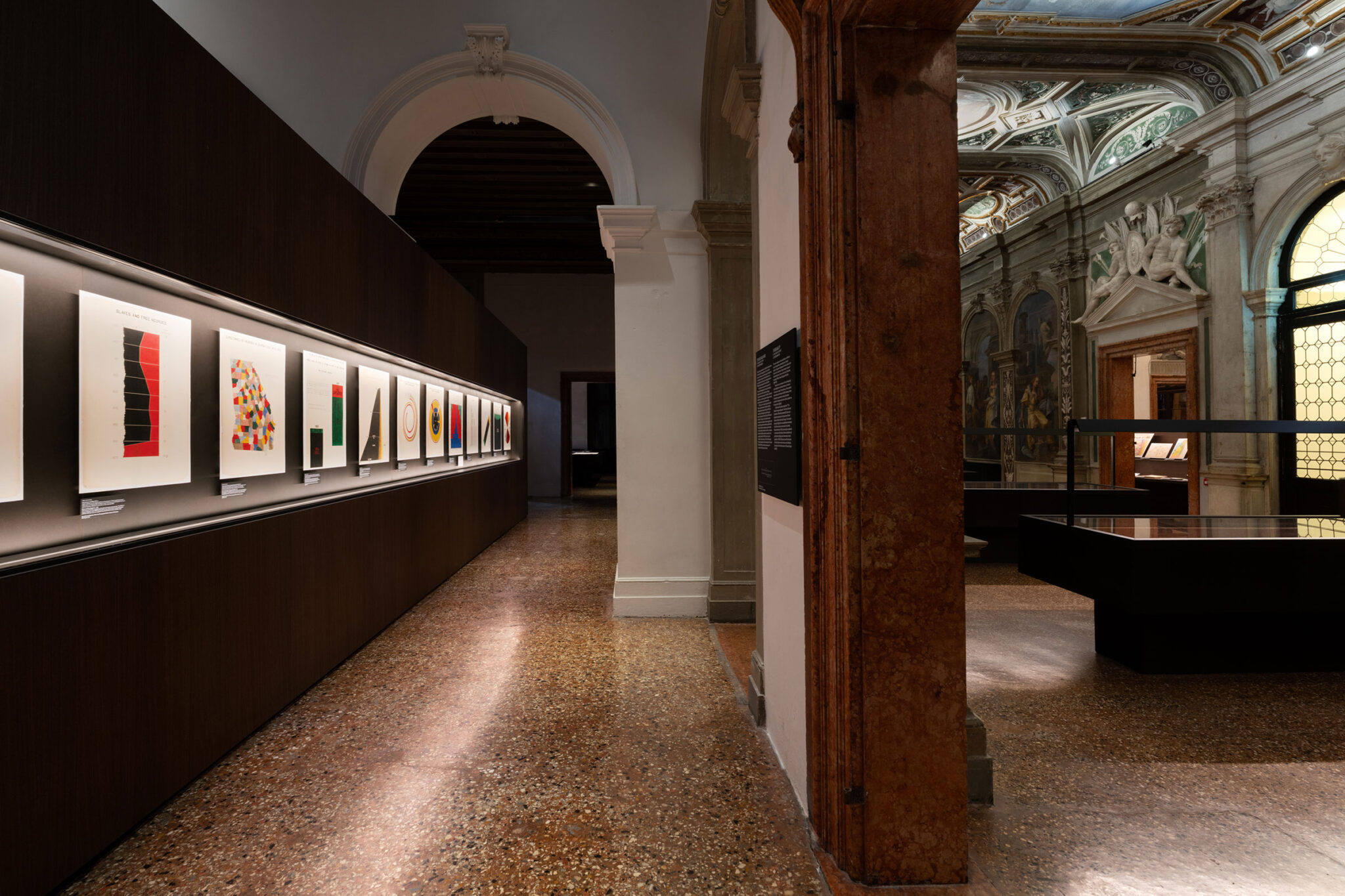
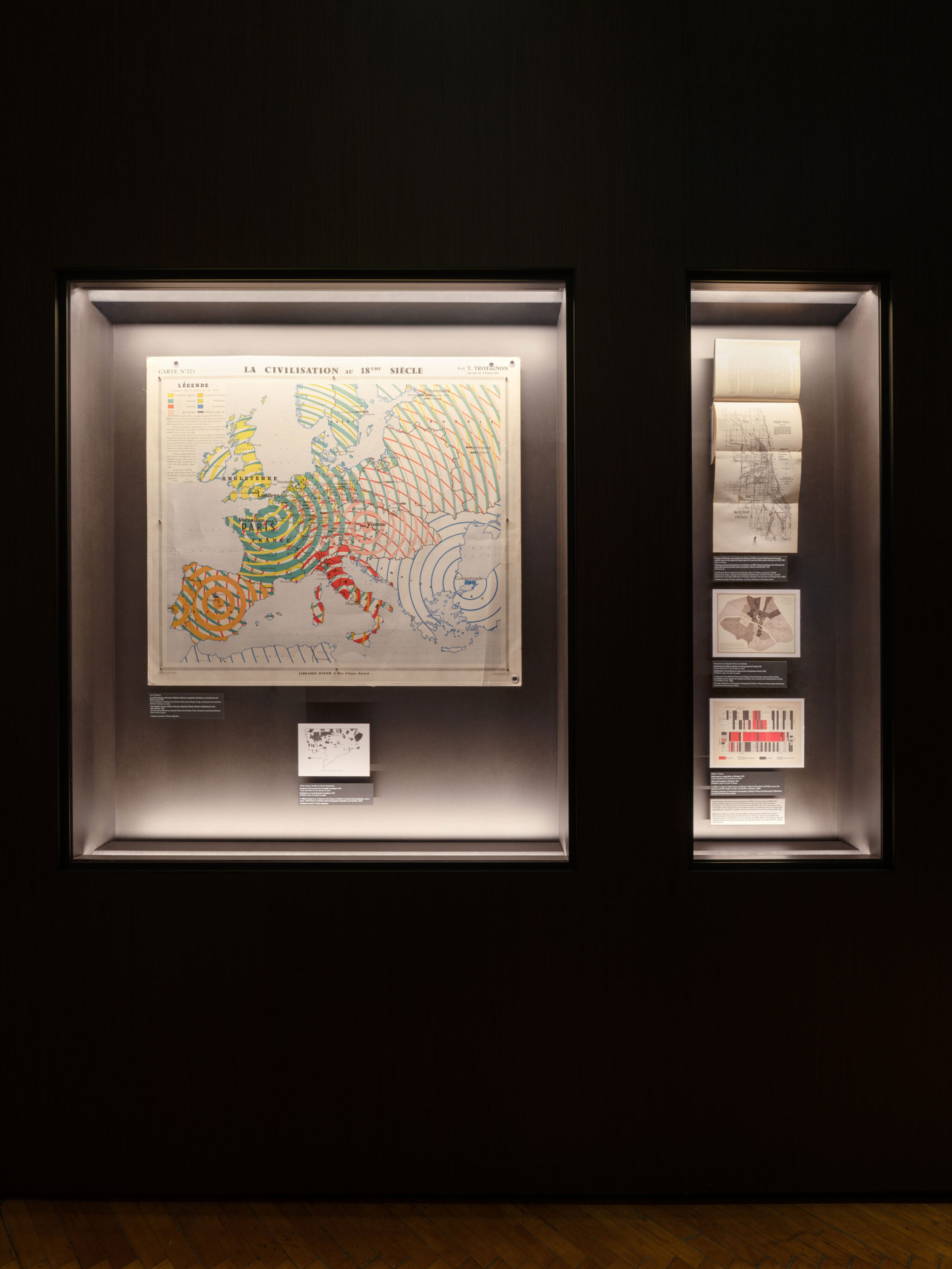
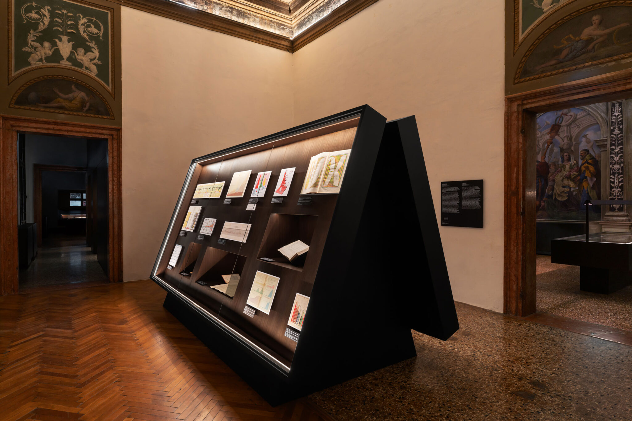
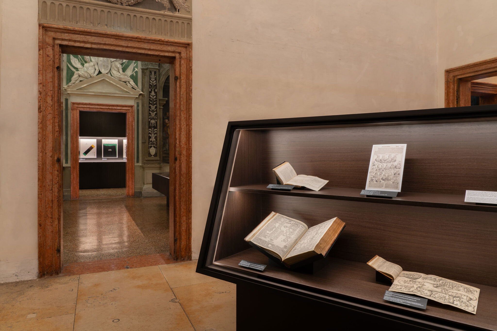
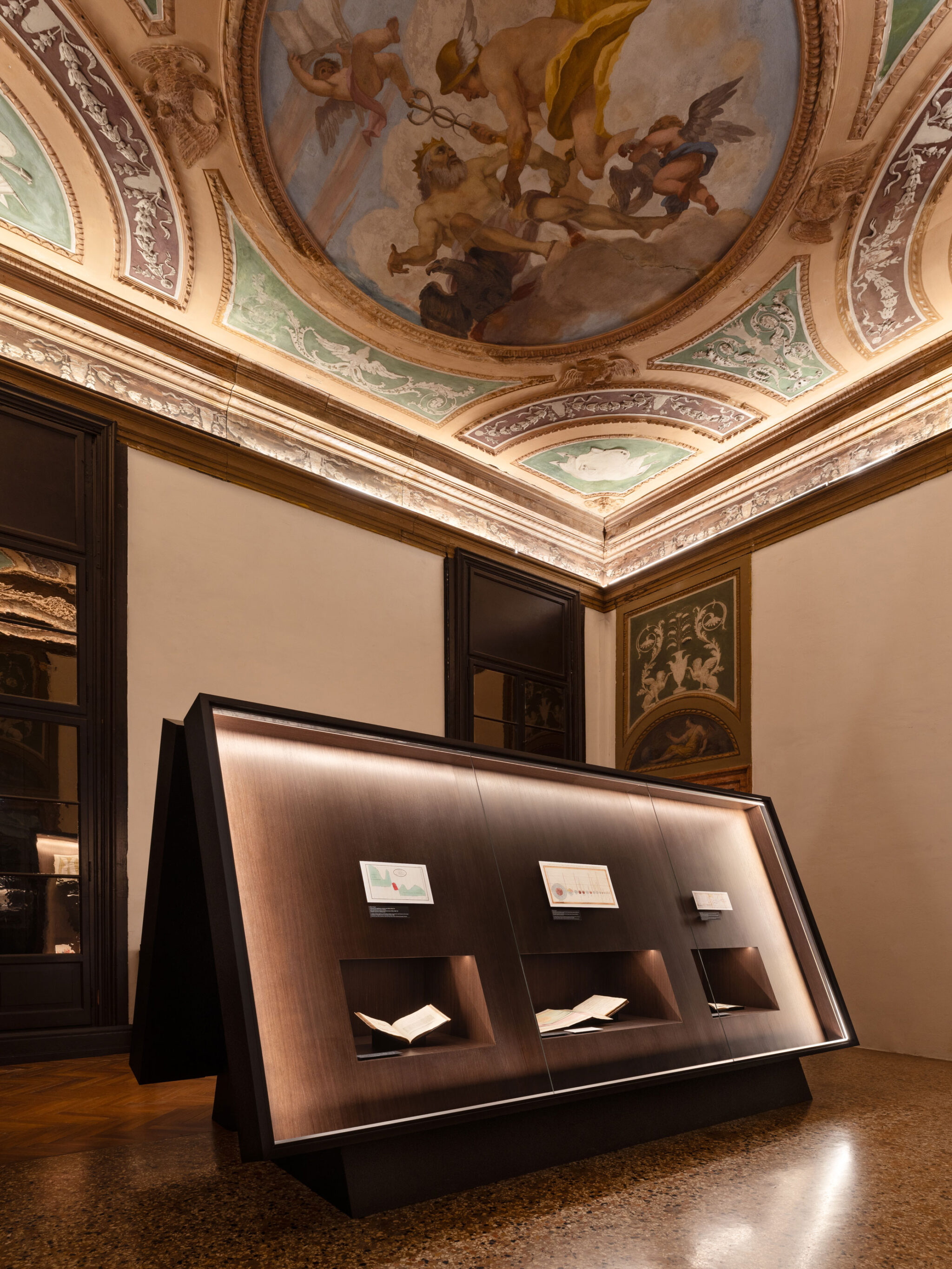
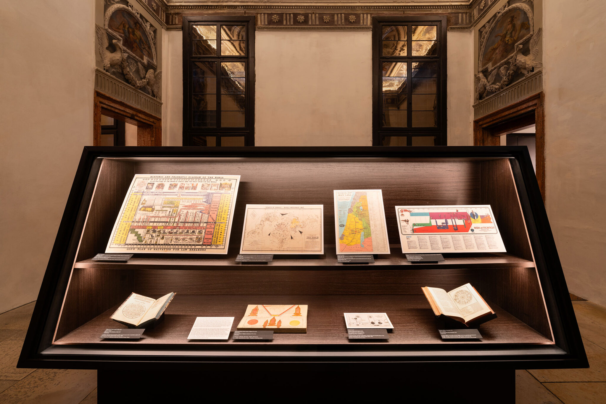
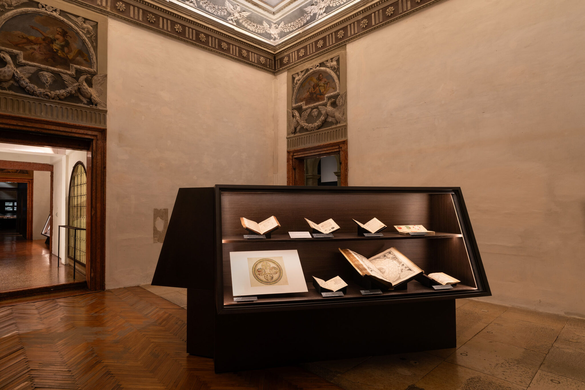
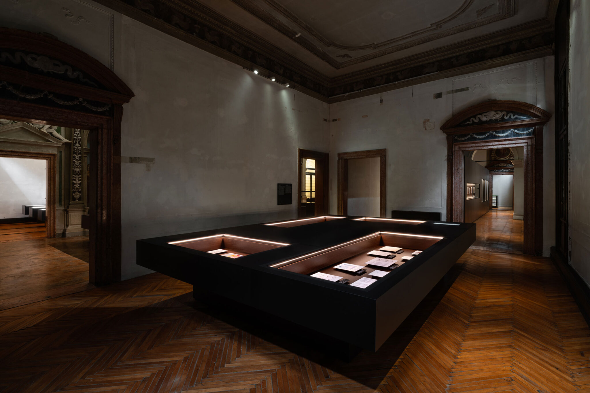
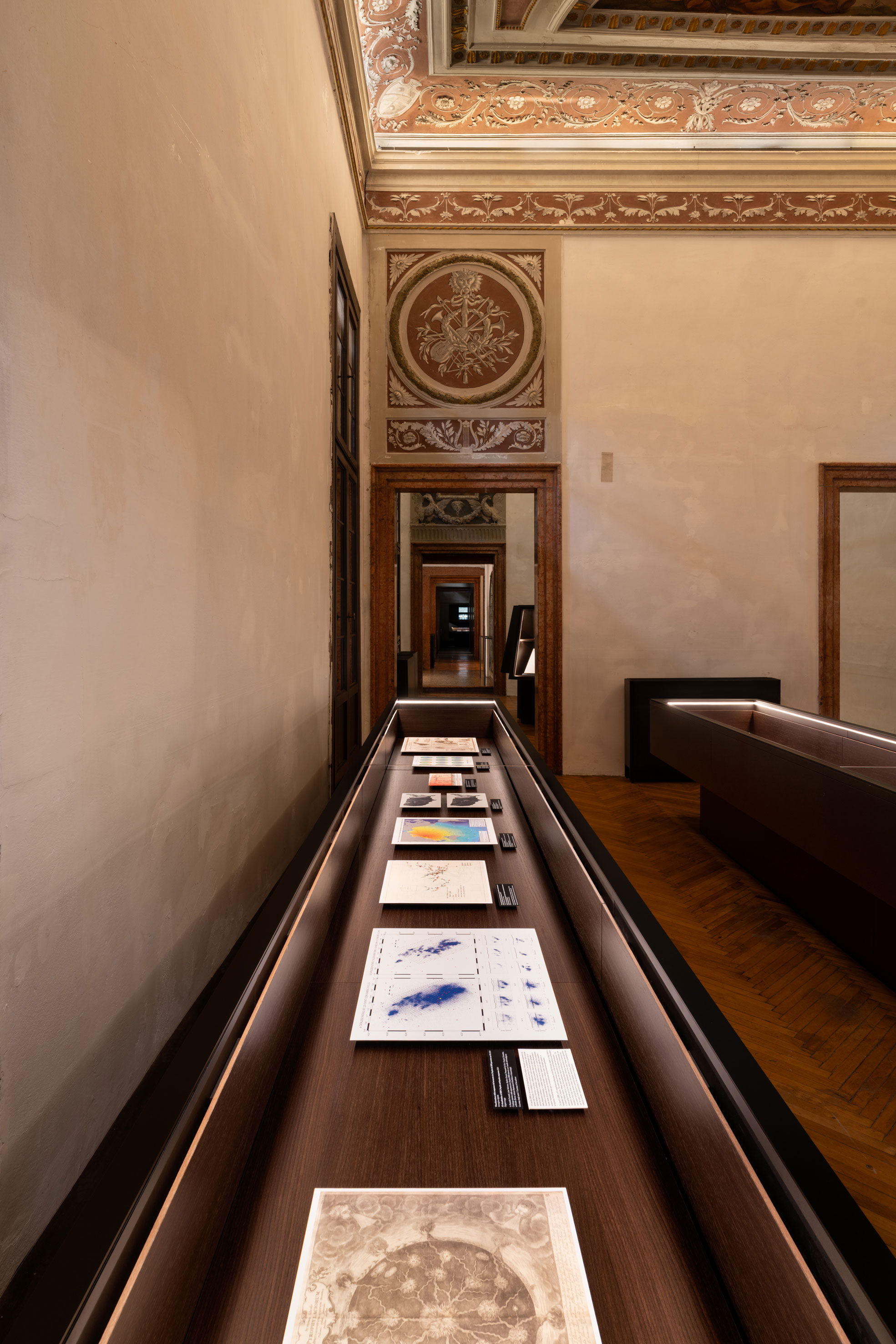
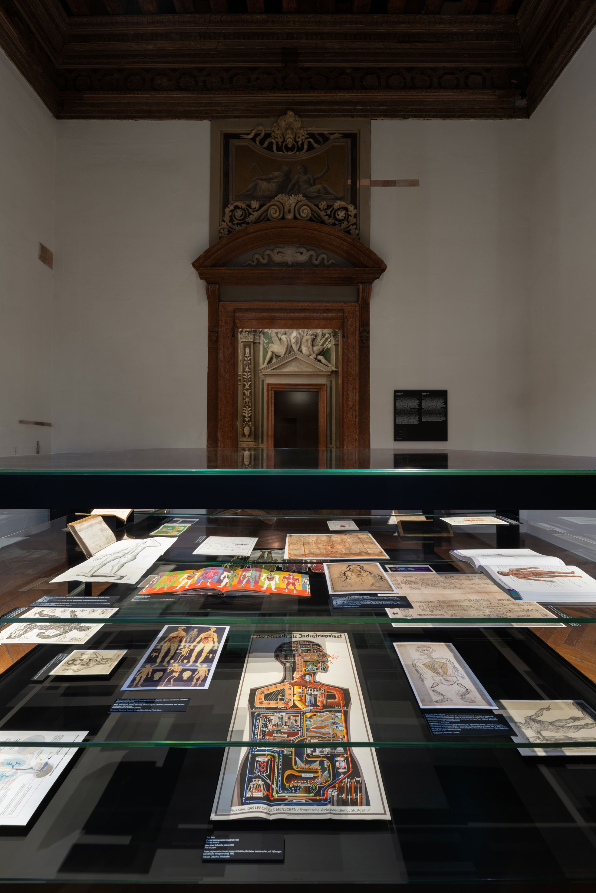
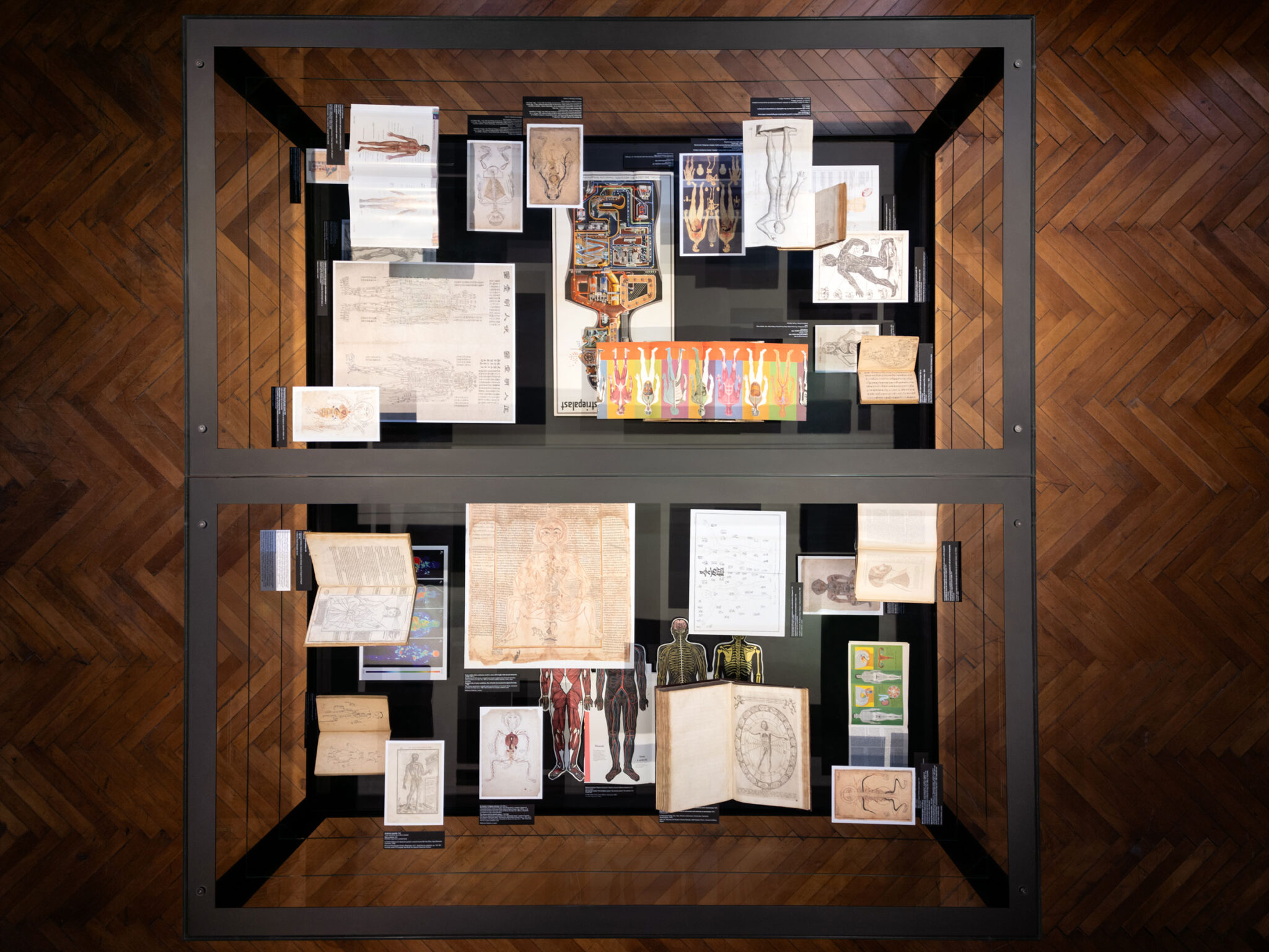
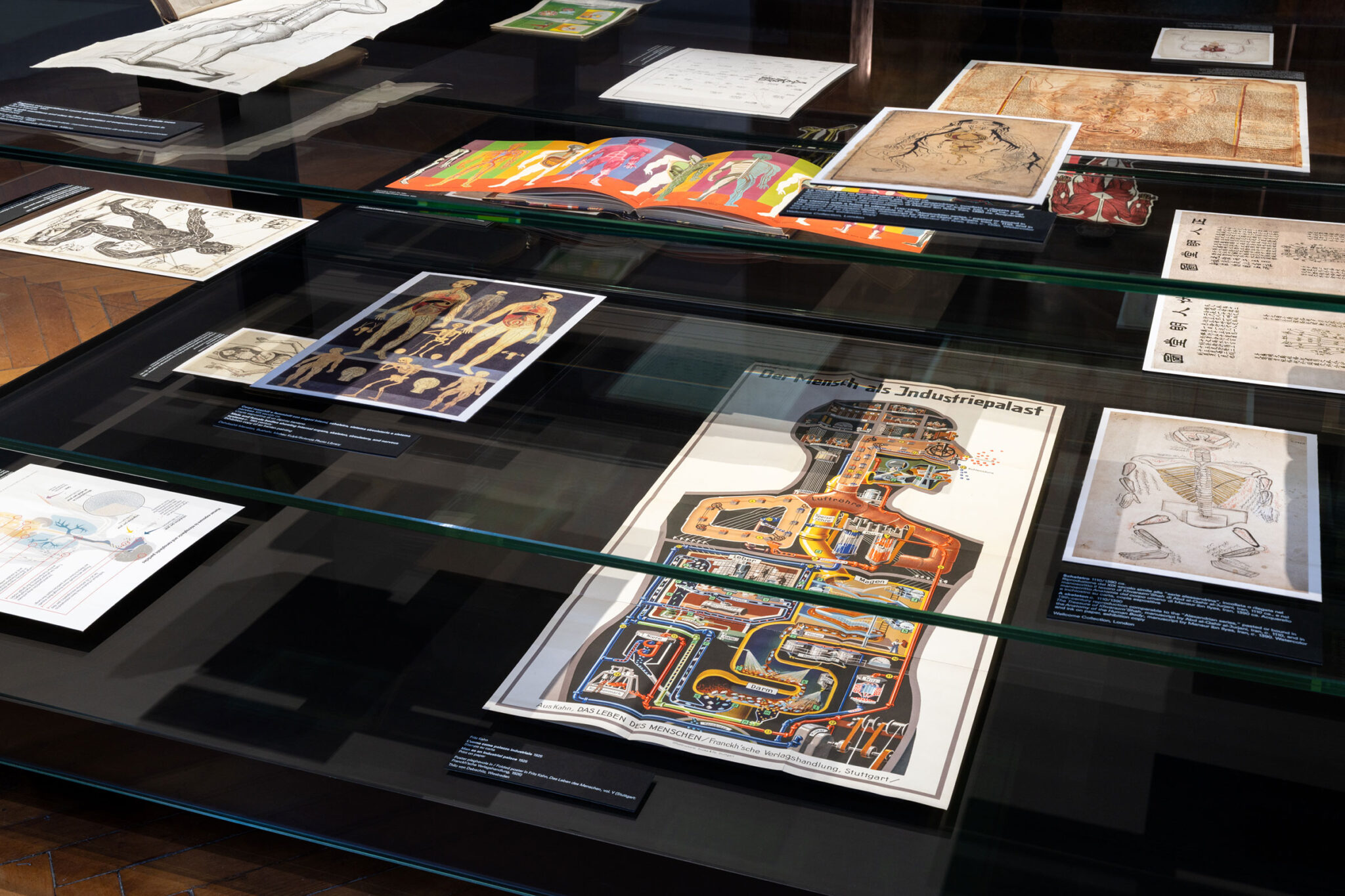
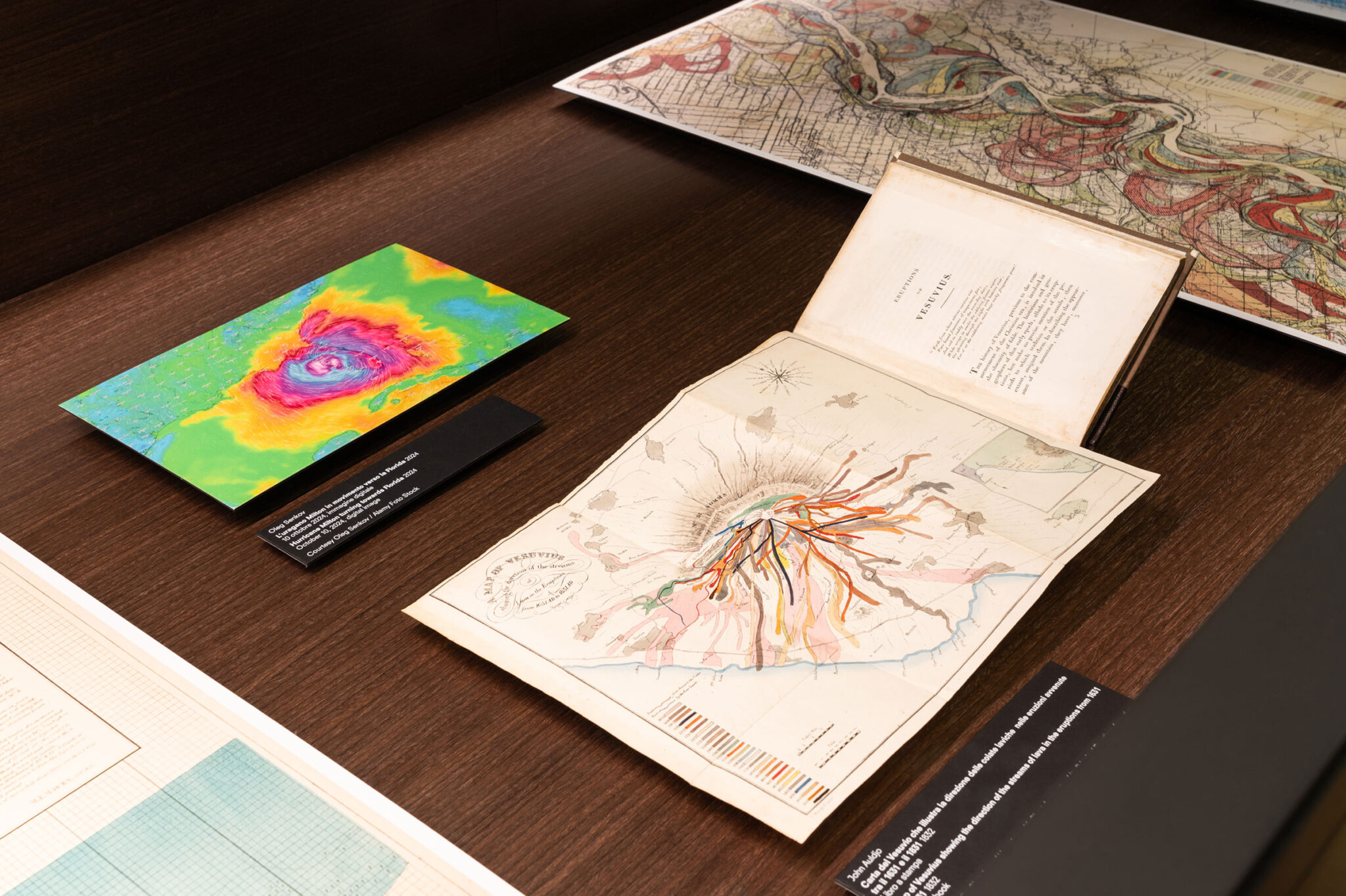
この展覧会は、18世紀に建てられたパラッツォ・カ・コルネール・デッラ・レジーナの1階および2階にわたって展示されており、12世紀から現代に至るまでの、さまざまな地理的および文化的背景に関連する貴重な文書、印刷物、デジタル画像、映像など300点以上の資料を集めています。これらの資料は、現代世界が抱える緊急課題を反映するだけでなく、実質的にダイアグラムが持つ横断的かつ通時的な性質を示す主題的な原則に基づいて展示されています。
本プロジェクトは、プラダ財団がレム・コールハースおよびOMAのアソシエイト・アーキテクトであるジュリオ・マルゲリ(Giulio Margheri)と緊密に連携して行った広範なリサーチの恩恵を受けています。マックス・プランク美術史研究所ビブリオテカ・ヘルツィアーナのマックス・プランク研究グループリーダーであるシーツケ・フランセン(Sietske Fransen)の専門知識が重要な役割を果たしました。
レム・コールハースが述べているように、「私の見解では、ダイアグラムはほぼ常に存在してきた道具です。たとえば、私たちのリサーチの初期段階で、紀元前4万年にまでさかのぼる南アフリカの三次元ダイアグラムや、アマッサリク島で作られたグリーンランドの海岸線を木彫りで表した地図を発見しました。これは、ダイアグラムが、その時代に存在するあらゆるメディアに適応する、不朽のコミュニケーションの形態であることを示しています。メディアの種類にかかわらず、ダイアグラムは、教示的(説明的)あるいは示唆的(説得的)な目的に用いられます。つまり、ダイアグラムはあらゆる新しいメディアにおいて自ずと存在するだけでなく、実質的に人間の生活のほぼすべての領域に適用可能であるということです。ファッション、宗教、あるいは社会的不平等の歴史も、ダイアグラムとして解釈することができます。私はダイアグラムのこの学際的な側面を非常に魅力的に感じています。それが持つ不変の特性――つまり言語(言葉)からの独立性によって、ダイアグラムは最も効果的な表現形態のひとつとなっているのです」
ダイアグラムは概ね、情報を可視化し、それについて考察し、伝達し、記録するための手段として捉えることができます。その結果として、それは中立的かつ客観的な表現として現れるのです。「ダイアグラムは事実そのものではなく、事実の可能性である」というジル・ドゥルーズ(Gilles Deleuze)の主張に基づき、本展はダイアグラムを、意味を生成する主体として捉え、人間の思考や生活に積極的に形を与え、影響を及ぼす存在として探究します。そしてそれは、誤解を生む媒体や、プロパガンダや政治的闘争の手段となる可能性も秘めているのです。
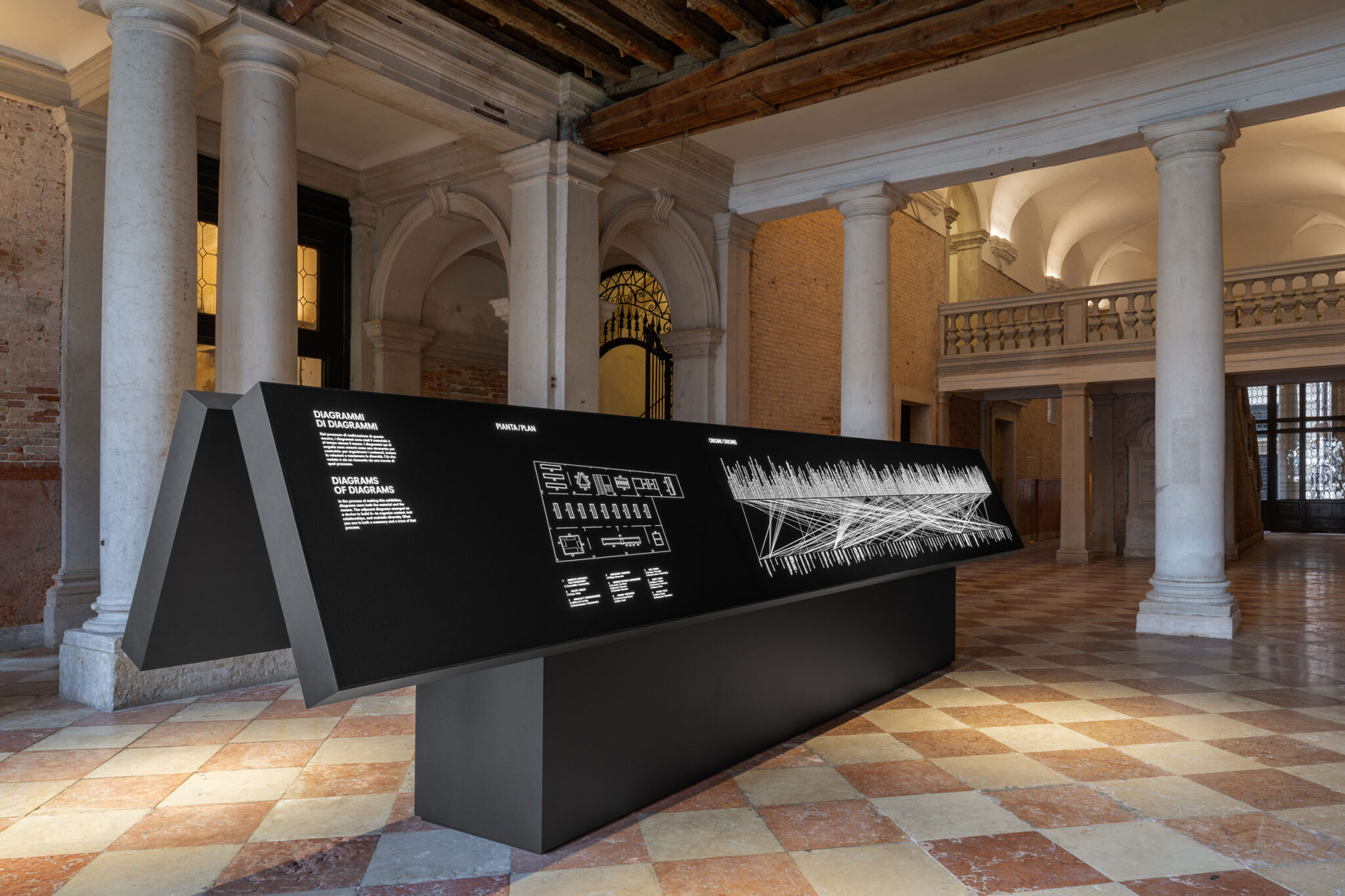
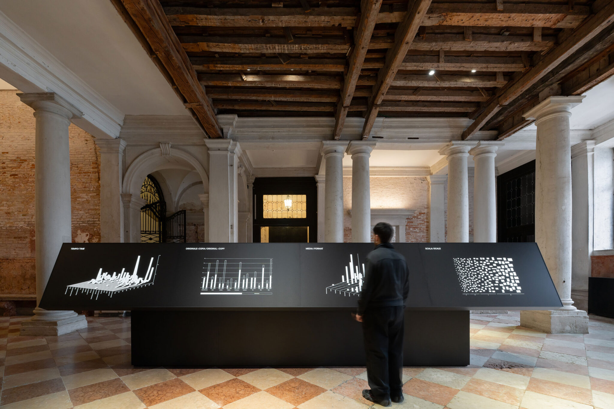
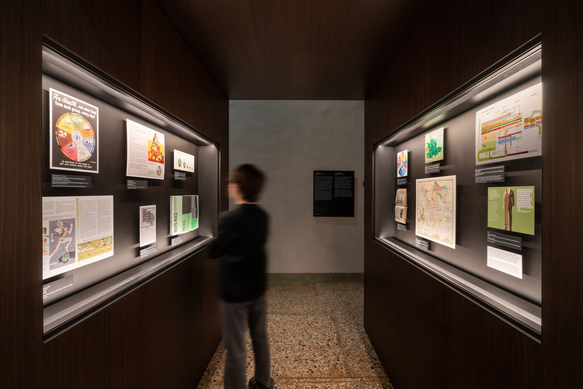
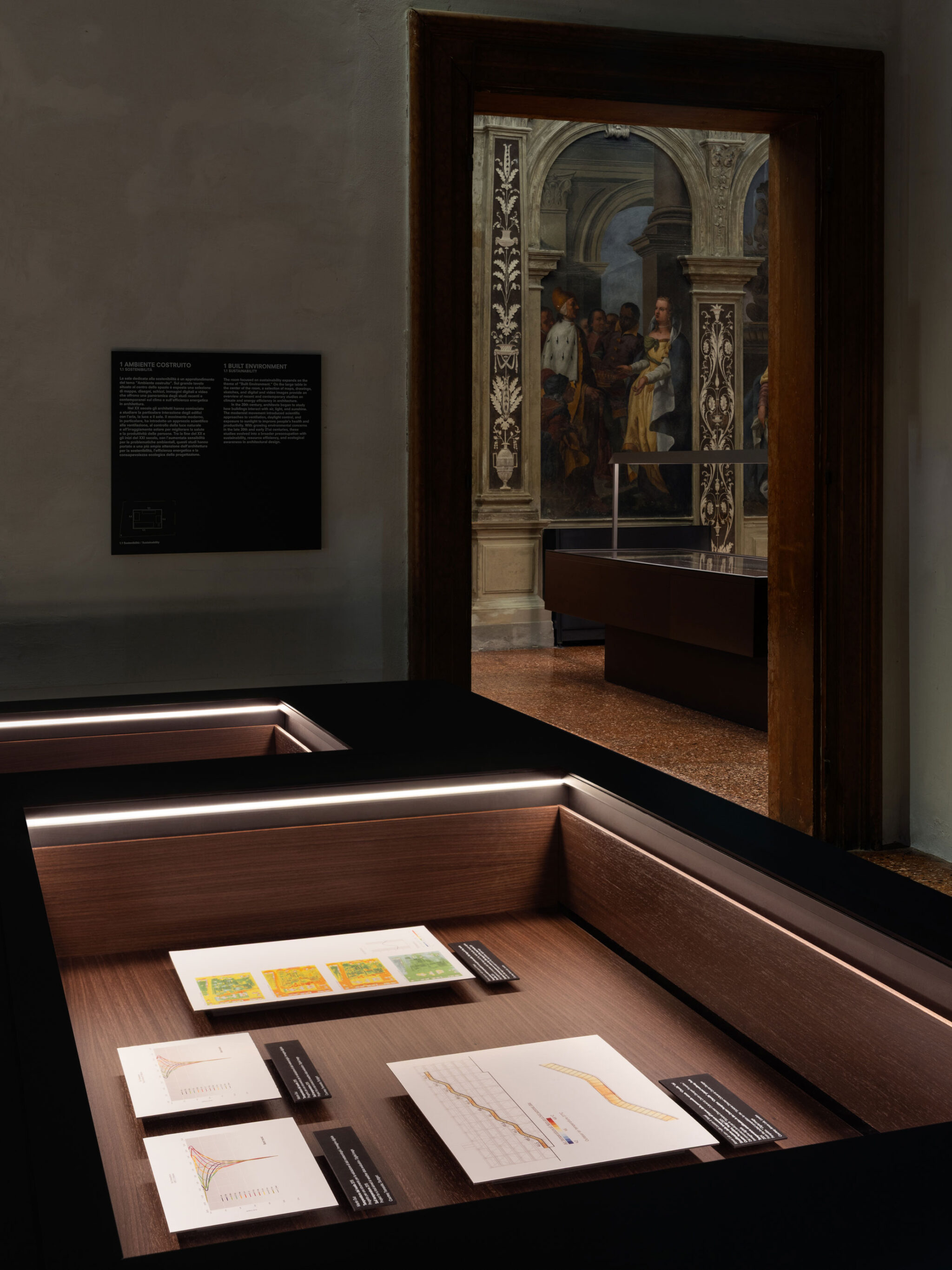
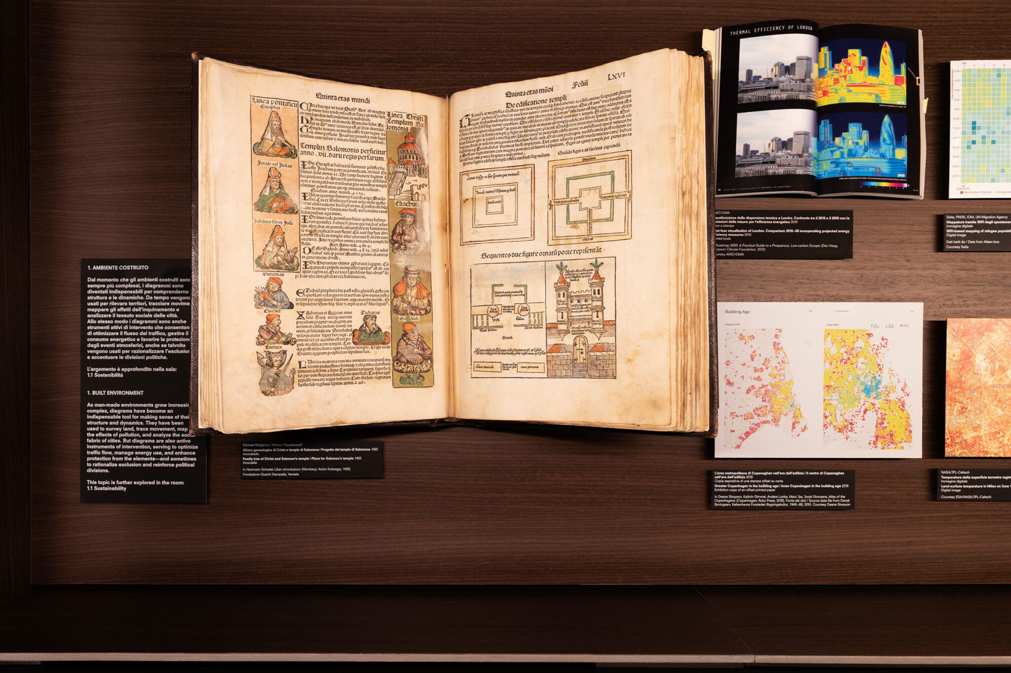
AMO/OMAが「now urgencies(今この瞬間の緊急課題)」という原則に基づいて設計した展示構成は、「建設環境」「健康」「不平等」「移民」「環境」「資源」「戦争」「真実」「価値」という9つの主要テーマに沿って構成されています。これらのテーマは、2階中央の部屋において、互いに平行に配置された一連の展示ケースによって表現されています。いわゆる「now urgencies(今この瞬間の緊急課題)」のそれぞれは、同じ階にある横の部屋でさらに掘り下げられており、特定のサブテーマや著名な作家の作品を探究するための異なる展示形式が用いられています。この複雑で多様な探究は、AMO/OMAによって制作されたセットによって1階で導入されており、それはダイアグラムによって構成された、展覧会全体のダイアグラムとして定義されることができます。このメタ・ダイアグラムは、リサーチおよび展示の手法を、その透明性と正確性のすべてにおいて明らかにしています。
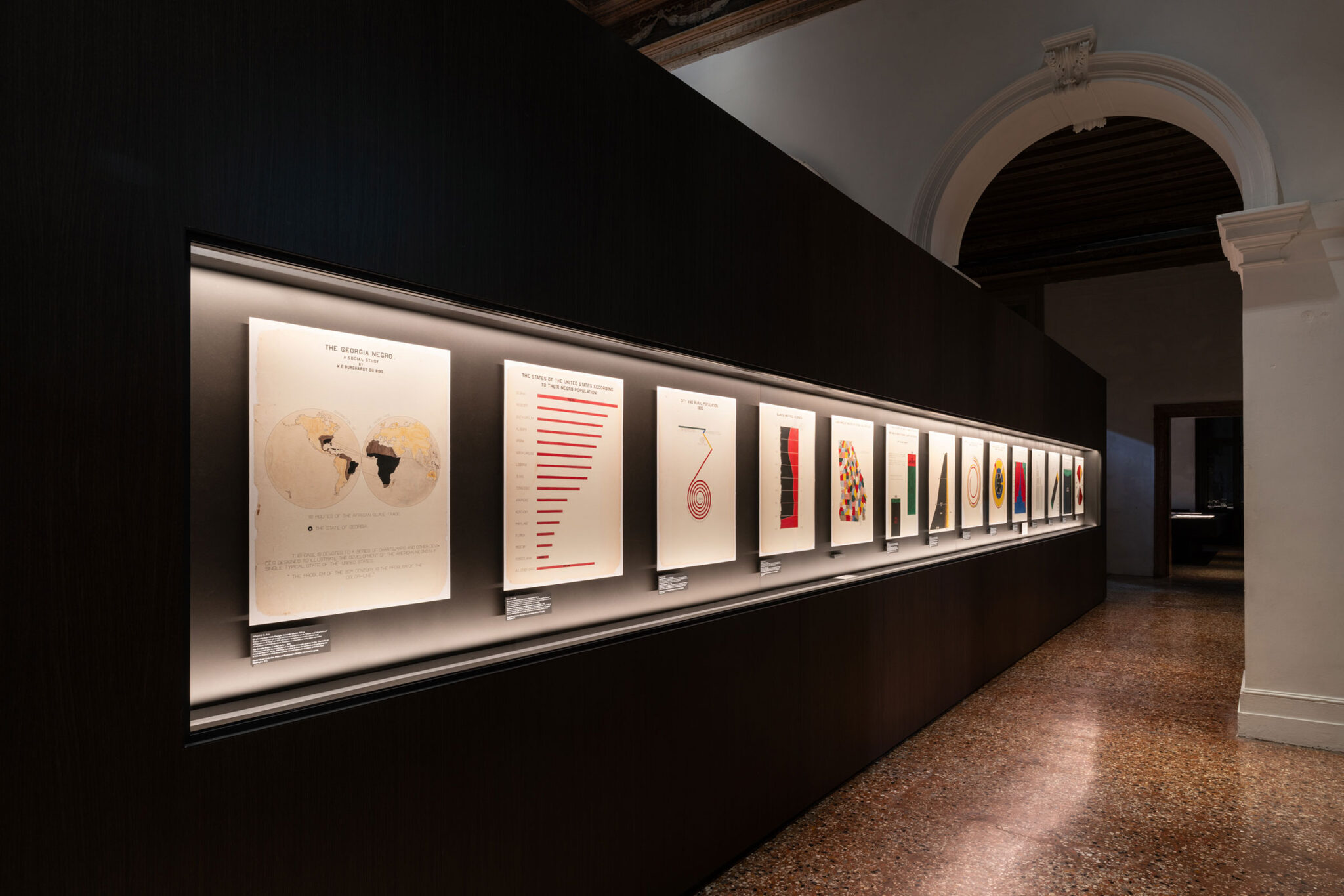
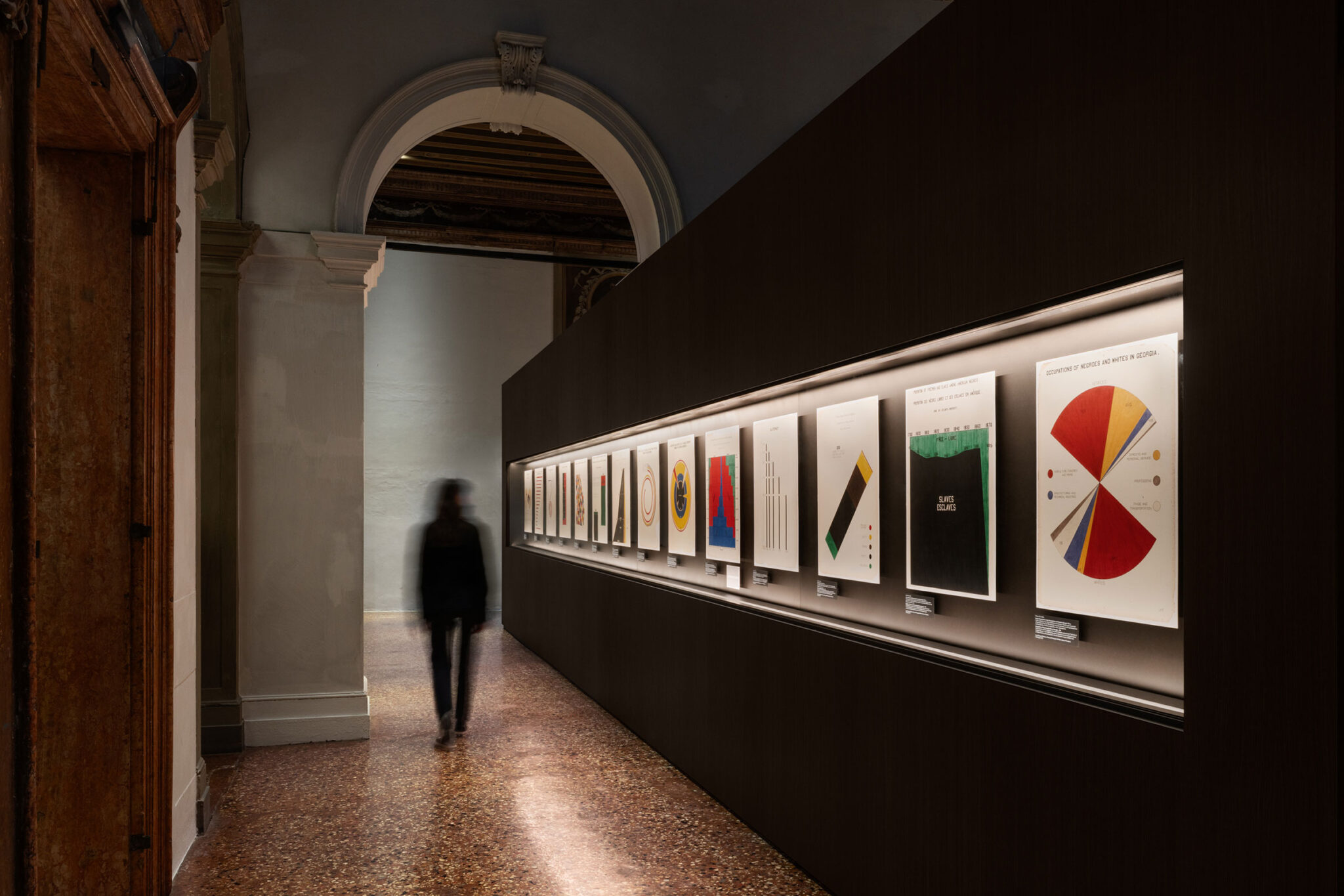
「Diagrams」の出発点は、19世紀後半から20世紀初頭にかけてアフリカ系アメリカ人コミュニティに関する研究とインフォグラフィックスで知られる、アフリカ系アメリカ人社会学者W.E.B.デュボイス(W.E.B. Du Bois, 1868–1963)の仕事にあります。彼が1900年のパリ万国博覧会における「The Exhibit of American Negroes(アメリカ黒人展)」のために制作した図表は、グラフィック表現の伝達力、さらには社会的調査やアクティビズムにおけるその可能性を探るための最初の参照点となっています。これらの作品は、やがて起こるマス・コミュニケーションの台頭のための基盤における重要な転換点を示しています。このケーススタディは、インフォグラフィックスが社会的正義、人種差別、民族的および宗教的少数派の表象、そしてアイデンティティに関する問題をどのように扱い、伝え、そしてしばしば省いてきたかを浮き彫りにしています。
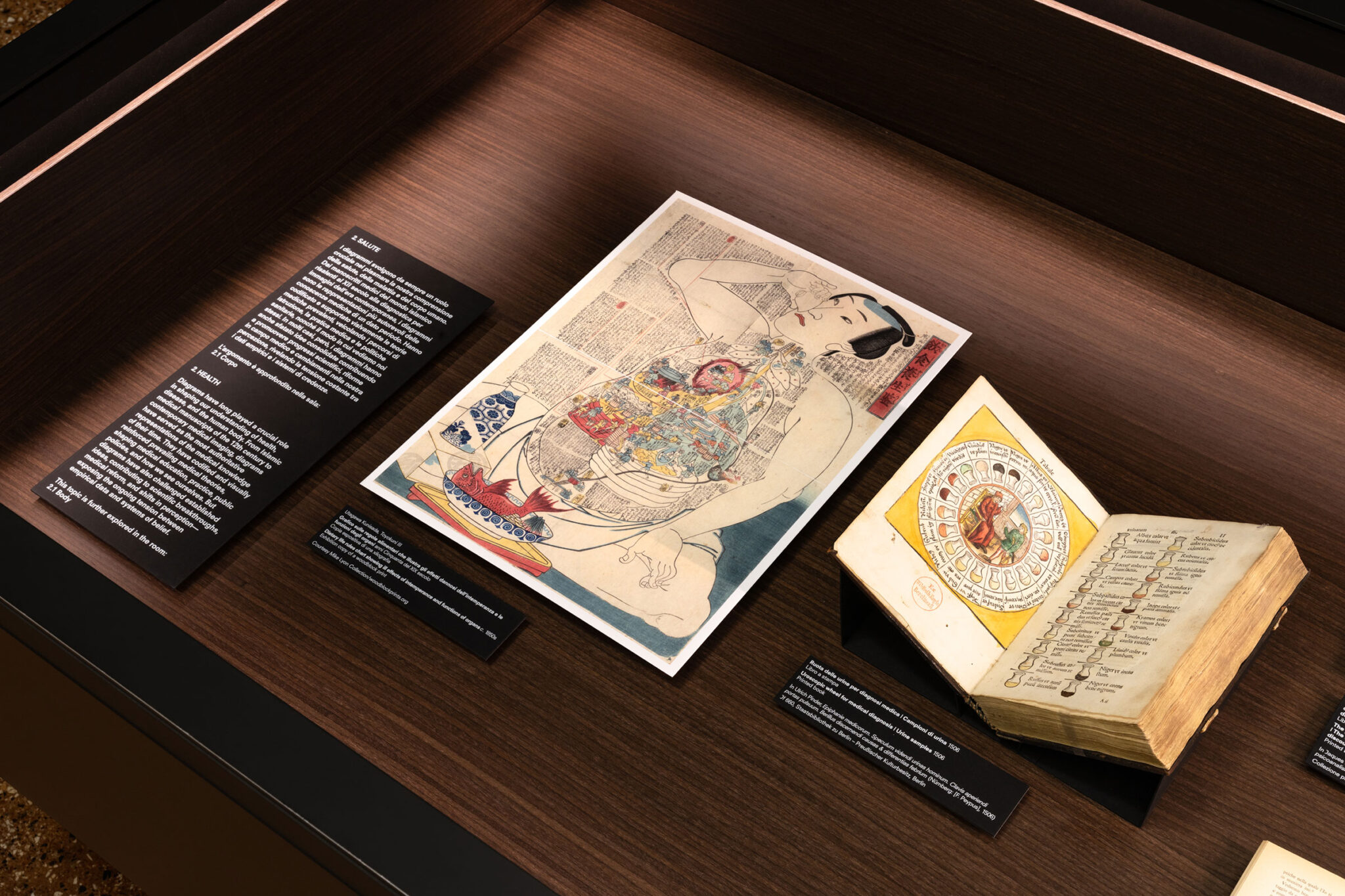
本展はまた、インフォグラフィックスの伝達力および観客がそれを正確に解釈する能力という観点における限界についても深く掘り下げています。この枠組みの中で、近代看護の創始者であるイギリス人フローレンス・ナイチンゲール(Florence Nightingale, 1820–1910)の事例は、医療分野における明確な視覚的コミュニケーションが、医療環境の改善を目的とした重要な立法の進展につながったことを浮き彫りにしています。このケーススタディは、世界各地の古代文化に由来する、この科学的領域に関連した膨大な文書や写本群を探究するための入口として機能しています。これは、インフォグラフィックスの利用が最近の現象でも、特定の西洋文化に限ったものでもなく、今なお人々の生活に具体的で意味のある影響を与え続けていることを示しています。このセクションはまた、科学の進歩と身体のケアの交差点に関する、より広範な議論の端緒ともなっています。特に現在では、高齢化の影響、人間の存在の時間的限界、そして身体的健康やウェルネスに対する文化的関心が、世論やメディアの議論の中心となっているのです。
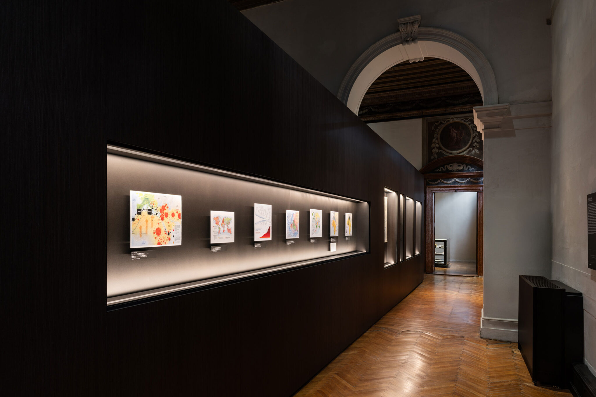
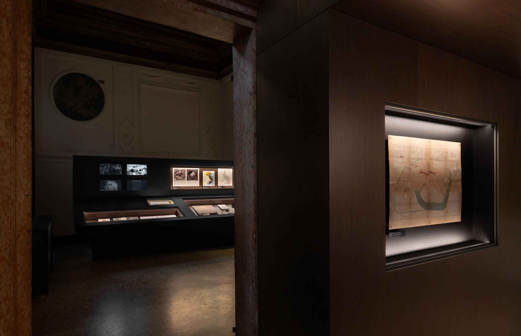
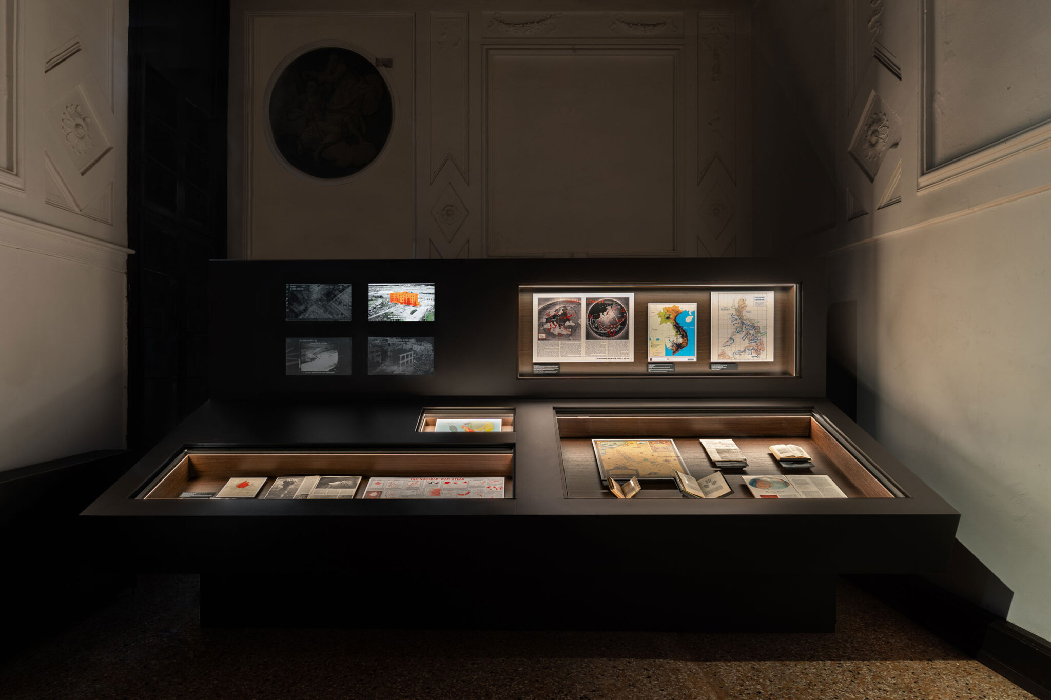
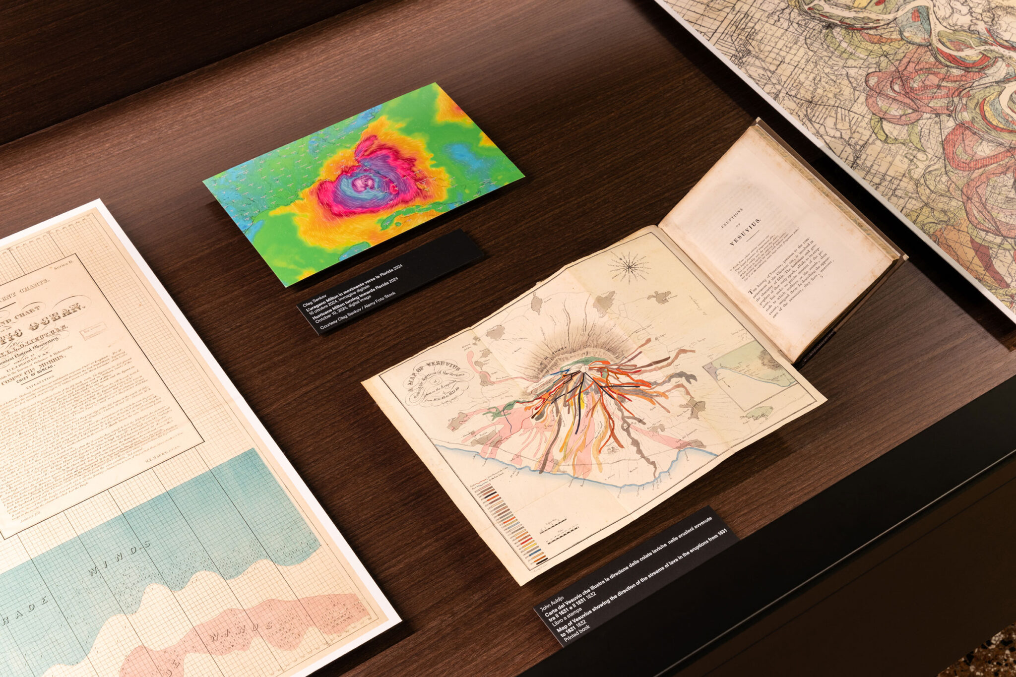
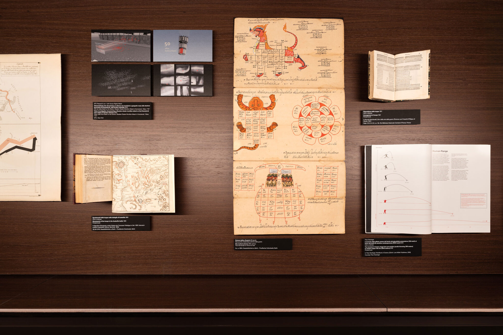
もう一つの重要なテーマ的な流れは「戦争」に焦点を当てています。フランスの土木技師シャルル=ジョゼフ・ミニャール(Charles Joseph Minard, 1781–1871)によって制作された、ナポレオンのロシア遠征を描いたダイアグラムは、データのグラフィカルな表現における画期的な成果と広く見なされています。本展は、ミニャールの視覚的革新を、スコットランドの政治経済学者ウィリアム・プレイフェア(William Playfair, 1759–1823)の業績や、20世紀の体制によるプロパガンダ・グラフィック、そして現代のスタジオによる調査的な制作活動と結びつける対話を展開しています。
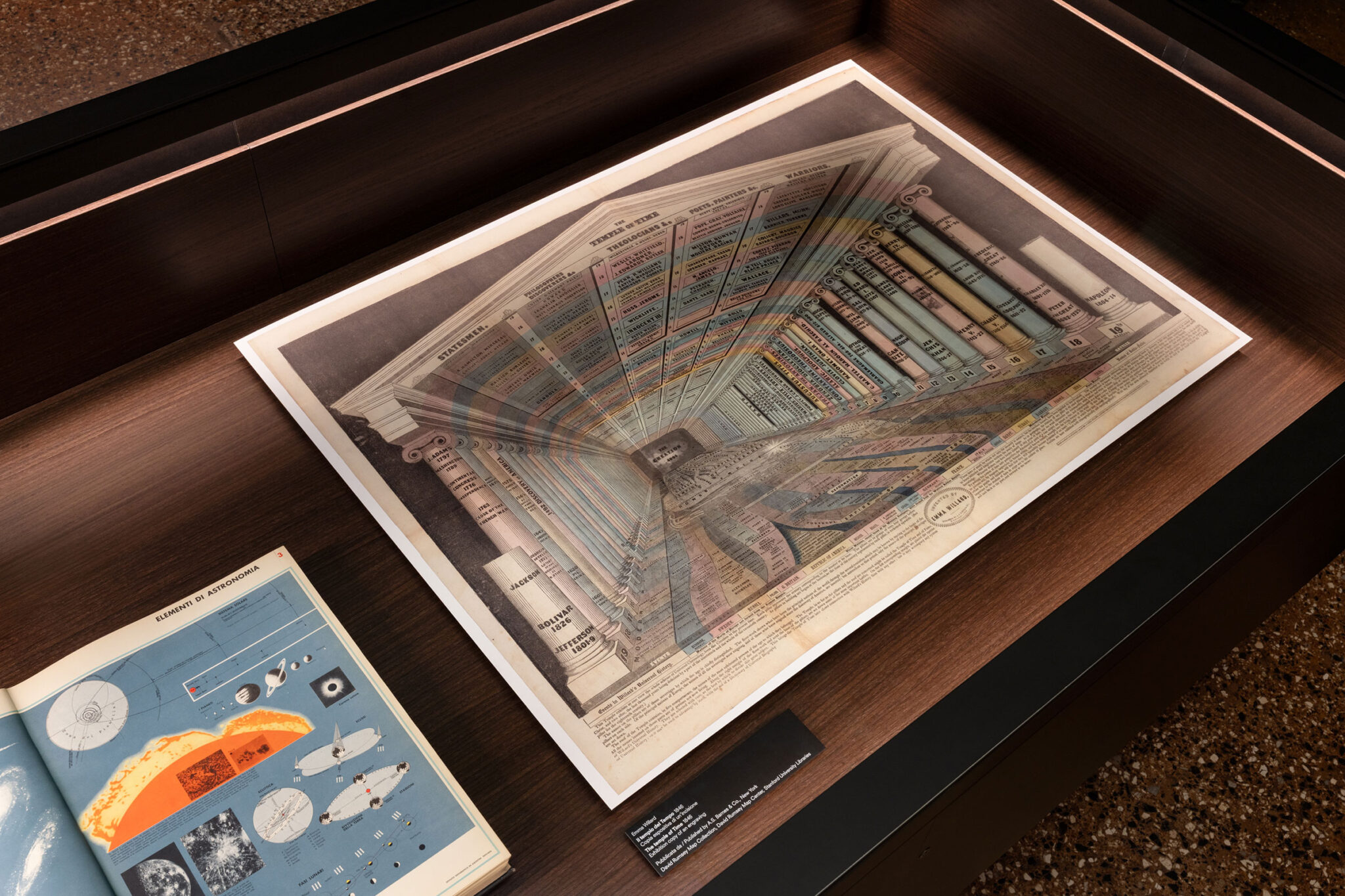
「インフォグラフィックスの黄金時代」とも呼ばれる19世紀は、社会政治的知識を伝える上でのデータの使用と誤用について考察する出発点となっています。19世紀初頭には、新たな印刷技術の登場が、教育の急速な普及と時を同じくして起こりました。この歴史的背景の中で、アメリカの先駆的なフェミニスト教育者エマ・ウィラード(Emma Willard, 1787–1870)は、革新的かつ創造的な「時間の地図」を特徴とする歴史と地理の教科書を出版し、データや情報を理解しやすい視覚的形式へと変換する手助けをしました。本展はまた、ダイアグラムが、ソーシャルメディアやオンラインプラットフォームによって促進されたビッグデータの圧倒的な力と断片化したコミュニケーション環境によって、その物語を歪める曖昧な道具として同時に機能し得ることを示しています。
18世紀から19世紀にかけて、インフォグラフィックの制作において、自然科学や生態学への関心が高まりを見せました。ドイツの博物学者で探検家のアレクサンダー・フォン・フンボルト(Alexander von Humboldt, 1769–1859)は、重要な人物でした。フンボルトの図像やダイアグラムは、データの視覚化および生態学的知識の伝達に関する議論の基盤を成しています。この議論は、今日の深刻な気候問題を踏まえると、さらに大きな重要性を帯びています。
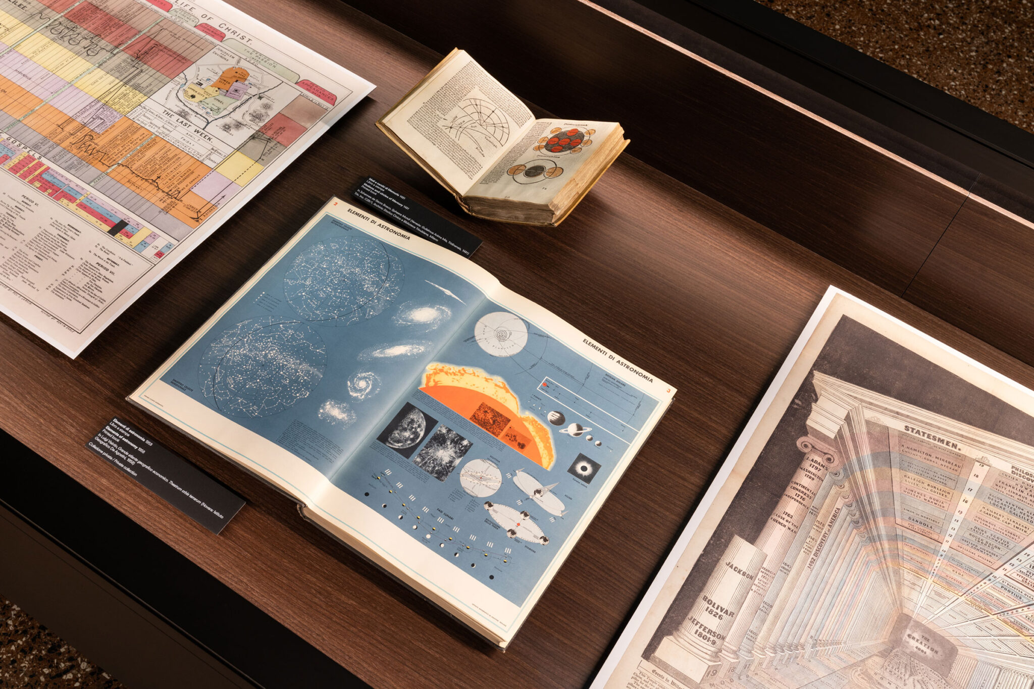
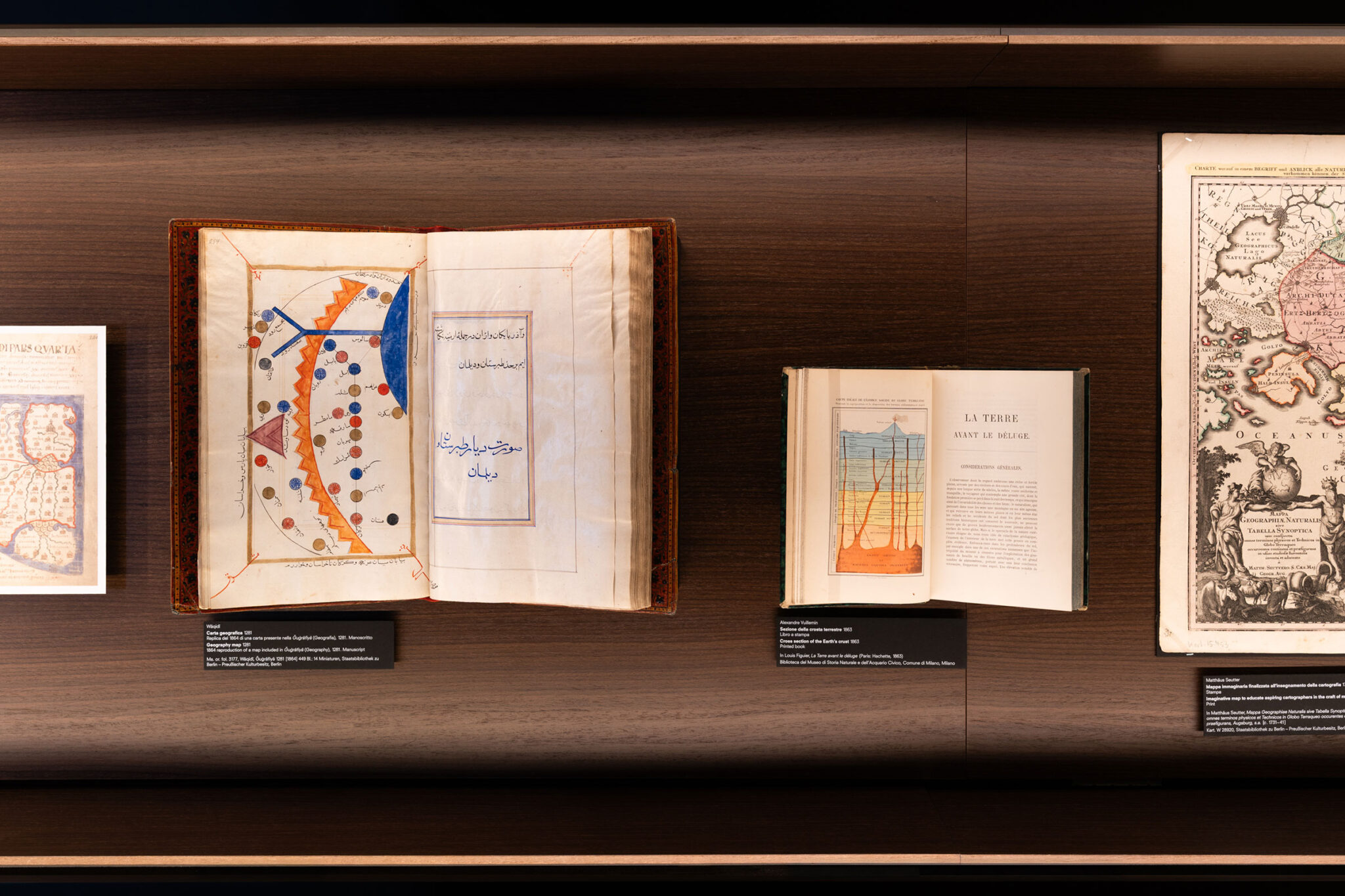
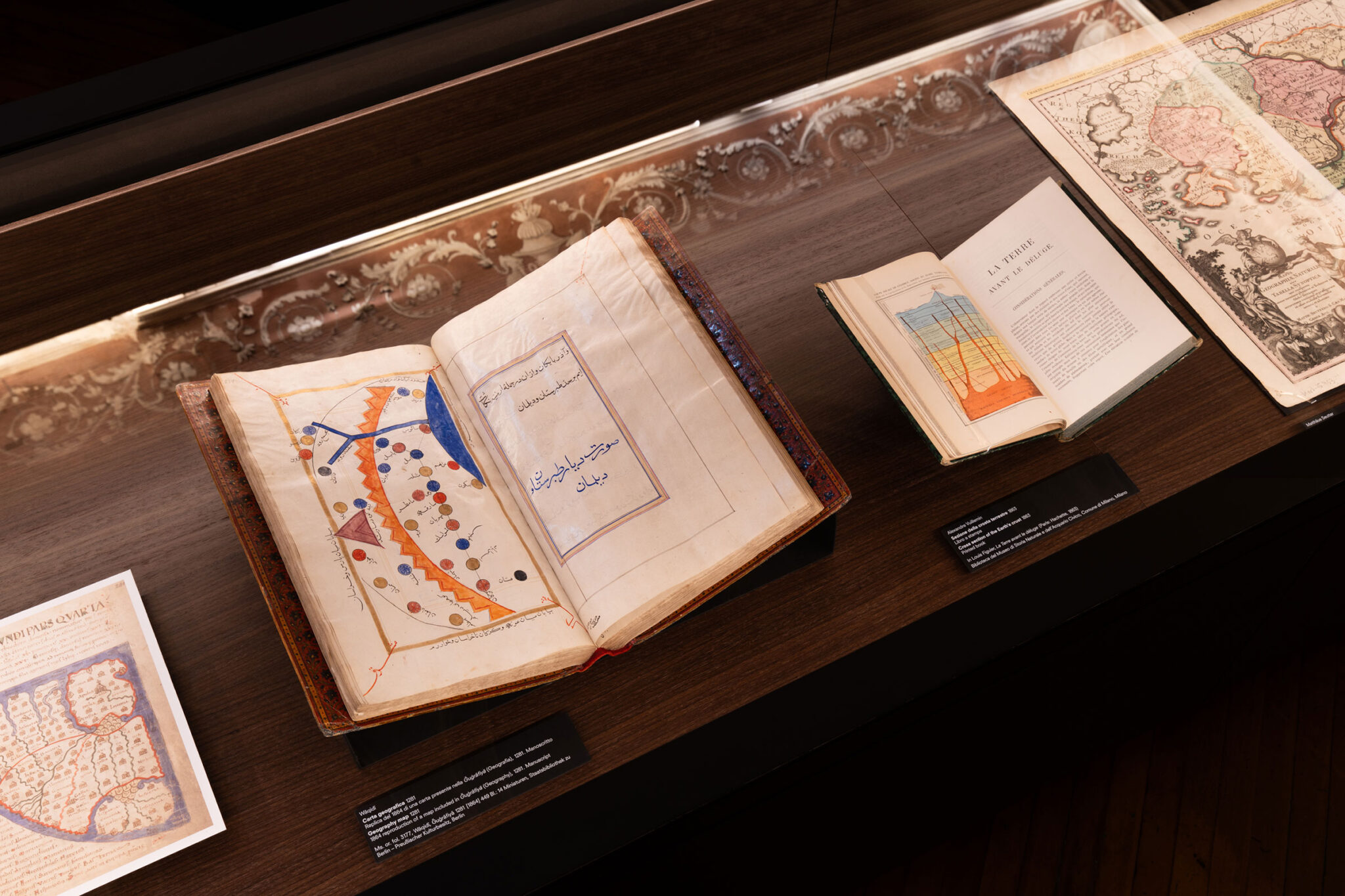
インフォグラフィックスの最も初期の例は、天文学的、地理的、あるいは宗教的知識と結びついており、文化的・知的エリートの間で限定的に流通することを意図して制作されていました。これはヨーロッパに限らず、アラブ、アジア、メソアメリカの文化にも当てはまり、この事実は、いくつかの古代文明に共通する文化的な地平についての省察を促します。このような理由から、ダイアグラムは、意味の生成における明確な主体として、また時には合意形成の手段として現れます。そしてそれはしばしば、宗教的・政治的・哲学的伝統に根ざしています。
古代と現代の継続的な相互作用は本展の物語を形作っており、それはダイアグラムの形式と内容を交差させるような思索を促します。インフォグラフィックによるコミュニケーションは、歴史的アヴァンギャルドの影響を受けながら、20世紀に形式的な進化を遂げました。モダニズムが視覚的コミュニケーションにもたらした重要な貢献は、古代および近代以前のインフォグラフィックスにおける形式的・美的・芸術的特性の回顧的な再評価を可能にしています。
本展の中心には、AMO/OMAのデザイン実践も位置づけられており、同スタジオは1970年代以降、建築のツールとしてダイアグラム的な形式を取り入れてきました。クールハースが説明するように、「複雑なアイデアというのは、知的な、あるいは時には芸術的な喜びのようなものであり、それは私たちの取り組みの原動力となっていました。そのような文脈において、ダイアグラムは非常に役立つものでした。私たちはそれらを調査しデザインすることによって、空間を形成しようと、あるいは別の建築を定義しようとしていました。その形を導き出すには、膨大な議論と明確な言語化が必要だったのです。もし私が数多くのダイアグラムを発見していなければ、私たちはその段階に到達することはできなかったでしょう。当時においてダイアグラムの役割は決定的でした。なぜなら、私たちが成し遂げたいことが実現可能であることを示すためには、物理的な「証拠の重み」が必要だったからです。今日の私はもはや、物事が可能であることを証明する必要のない、別の立場にいるのかもしれません。そしてそれは確かに、ダイアグラムの本質や役割を変えるものとなっています。しかし、私は今でもダイアグラムが自分のレパートリーの重要な一部であると言えるでしょう」
本展にはまた、Atmos Labや Transsolarといった国際的なプラットフォームによって展開されてきた重要かつ近年の環境デザインおよび都市計画の実践に加え、テオ・ドイティンガー(Theo Deutinger)やSITU Researchなどによる調査的な実践や研究者の貢献も含まれています。
「Diagrams」には、プラダ財団から刊行され、イルマ・ブーム(Irma Boom)がデザインを手がけた図版入りの書籍が付随します。この書籍には、プラダ財団の会長兼ディレクターであるミウッチャ・プラダ(Miuccia Prada)による序文、レム・コールハースとカティア・イノゼムツェワ(Katya Inozemtseva)の対談、そして著名な国際的学者やデザイナーであるアルベルト・カイロ(Alberto Cairo)、ケイト・クロフォード(Kate Crawford)、テオ・ドイティンガー(Theo Deutinger)、シーツケ・フランセン(Sietske Fransen)、スコット・ラインハード(Scott Reinhard)、フィリップ・レカセヴィッツ(Philippe Rekacewicz)、サンドラ・レンドゲン(Sandra Rendgen)、マルキット・ショシャン(Malkit Shoshan)、杉浦康平(Kohei Sugiura)による9本のエッセイが収録されています。
以下の写真はクリックで拡大します

以下、リリーステキストです。
DIAGRAMS: A PROJECT BY AMO/OMA
DIAGRAMS: A PROJECT BY AMO/OMA Venice, 7 May 2025 – Fondazione Prada presents “Diagrams”, an exhibition project conceived by AMO/OMA, the studio founded by Rem Koolhaas, in its Venetian venue, Ca’ Corner della Regina, from 10 May to 24 November 2025.
“Diagrams” investigates the visual communication of data as a powerful tool for constructing meaning, comprehension or manipulation and a pervasive instrument for analyzing, understanding and transforming the surrounding world. It seeks to foster dialogue and speculative reflection on the relationship between human intelligence, scientific and cultural phenomena, and the creation and dissemination of knowledge.
The exhibition, on view on the ground and first floors of the 18th-century Palazzo Ca’ Corner della Regina, gathers more than 300 items, including rare documents, printed publications, digital images, and videos, spanning from the 12th century to the present day and related to various geographical and cultural contexts. This material is displayed according to a thematic principle that reflects not only contemporary world urgencies but also, de facto, demonstrates the diagram’s transversal and diachronic nature.
The project benefits from the extensive research conducted by Fondazione Prada in close collaboration with Rem Koolhaas and Giulio Margheri, Associate Architect at OMA. The expertise of Sietske Fransen, Max Planck Research Group Leader, Bibliotheca Hertziana – Max Planck Institute for Art History, was instrumental.
As stated by Rem Koolhaas, “In my view, the diagram has been an almost permanent tool. For example, in the early stages of our research, we discovered three-dimensional diagrams from South Africa dating back to 40,000 BCE, as well as wood-carved maps of the Greenlandic coastline made on the island of Ammassalik. This demonstrates that the diagram is an enduring form of communication that adapts to whatever medium exists at the time. Regardless of the medium, a diagram serves didactic (explanatory) or suggestive (persuasive) purposes. This means that it not only exists by default in any new medium but can also be applied to virtually any area of human life. Fashion, religion, or the history of social inequality can be interpreted as a diagram. I deeply enjoy this interdisciplinary aspect of the diagram, its invariable attribute—its independence from language (words) makes it one of the most effective forms of representation.”
A diagram can be roughly described as an instrument for envisioning information to reason about, communicate, and document, so that it appears as a neutral and objective representation. Drawing on Gilles Deleuze’s assertion that “the diagram is the possibility of a fact, not the fact itself,” the exhibition explores the diagram as an agent of meaning-making that actively shapes and influences human thought and life, and potentially becomes a vehicle for misconceptions or a tool of propaganda and political struggle.
The exhibition system, designed by AMO/OMA according to the “now urgencies” principle, is structured according to nine primary topics: Built Environment, Health, Inequality, Migration, Environment, Resources, War, Truth, and Value. These themes are illustrated in the central room of the first floor in a series of vitrines arranged in parallel to one another. Each of the so-called “now urgencies” is further explored in a lateral room on this floor, with different display formats that help investigate specific subthemes or the work of a prominent author. This complex and diverse investigation is introduced on the ground floor by a set created by AMO/OMA, which can be defined as a diagram of the exhibition, composed of diagrams. This meta-diagram reveals the research and display methods in all their transparency and accuracy.
The starting point of “Diagrams” is the work of W.E.B. Du Bois (1868–1963), the African-American sociologist renowned for his studies and infographics on African-American communities in the late 19th and early 20th centuries. The charts he created for “The Exhibit of American Negroes” at the Exposition Universelle in Paris in 1900 serve as an initial reference for exploring the communicative power of graphic representation, as well as its potential for social inquiry and activism. These works mark a pivotal moment in the foundation for the eventual rise of mass communication. This case study highlights how infographics have addressed, communicated, and often omitted issues related to social justice, racism, the representation of ethnic and religious minorities, and identitarian questions.
The exhibition also delves into the limitations of infographics in terms of their communicative capacity and the audience’s ability to interpret them accurately. In this framework, the case of the English founder of modern nursing, Florence Nightingale (1820–1910), highlights how clear visual communication in the medical field led to significant legislative progress aimed at improving healthcare conditions. This case study functions as a gateway to exploring a substantial body of documents and manuscripts related to this scientific domain, sourced from ancient cultures around the world. It demonstrates that the application of infographics is neither a recent phenomenon nor an exclusively Western one, and that it continues to have a tangible, meaningful impact on people’s lives. This section also initiates a broader discussion about the intersection of scientific progress and body care, particularly at present when the effects of ageing, the temporal limits of human existence, and the cultural emphasis on physical health and wellness are central in the public and media debate.
Another significant thematic strand focuses on war. The diagram of Napoleon’s campaign in Russia, created by the French civil engineer Charles Joseph Minard (1781-1871), is widely considered to be a milestone in the graphical representation of data. The exhibition develops a dialogue that connects Minard’s visual innovations with those of the Scottish political economist William Playfair (1759-1823), propaganda graphics from 20th-century regimes, and the investigative work of contemporary studios.
The 19th century, referred to as the Golden Age of Infographics, is a point of departure for reflecting on the use and misuse of data in communicating sociopolitical knowledge. In the early part of the century, the advent of new printing techniques coincided with the rapid expansion of education. In this historical context, pioneering American feminist educator Emma Willard (1787–1870) published history and geography textbooks featuring innovative and creative maps of time, which helped translate data and information into manageable visual forms. The exhibition also demonstrates how diagrams can simultaneously serve as ambiguous instruments for distorting narratives, enhanced by the overwhelming power of big data and a fragmented communication landscape driven by social media and online platforms.
In the 18th and 19th centuries, a growing interest in the natural sciences and ecology emerged in infographic production. The German naturalist and explorer Alexander von Humboldt (1769–1859) was a significant figure. Von Humboldt’s graphics and diagrams represent the foundation for a discourse on data visualization and the communication of ecological knowledge. This discussion assumes even greater significance in light of today’s critical climate challenges.
The earliest examples of infographics are linked to astronomical, geographical, or religious knowledge and were designed for limited circulation among cultural and intellectual elites. This is true not only in Europe but also in Arab, Asian, and Mesoamerican cultures, a fact that encourages reflection on the shared cultural horizons of certain ancient civilizations. For this reason, diagrams emerge as explicit agents of meaning-making and, at times, consensus-building, often rooted in religious, political, or philosophical traditions.
The continuous interplay between the ancient and the modern, which defines the exhibition’s narrative, fosters a reflection that intertwines the form and content of diagrams. Infographic communication formally evolved in the 20th century, influenced by historical avant-gardes. Modernism’s significant contributions to visual communication enable a retrospective reassessment of the formal, aesthetic, and artistic qualities of ancient and pre-modern infographics.
Central to the exhibition is also AMO/OMA’s design practice, which has integrated diagrammatic forms as architectural tools since the 1970s. As Koolhaas explains, “Complex ideas are almost an intellectual or sometimes artistic pleasure, and they became a driving element in what we were trying to do. In this context, diagrams were incredibly helpful. By researching and designing them, we were trying to form a space or to define another architecture, the form of which required an enormous amount of argument and articulation. We would not have come close to that if I had not discovered a number of diagrams. The role of diagrams was crucial at that time because we needed the physical burden of proof to show that what we wanted to achieve was possible. Today, I may find myself in a different position, where I no longer have to prove that things are possible, and that certainly changes the nature or the role of diagrams. But I would still say that diagrams are an important part of my repertoire.”
The exhibition also includes the contributions of other significant and recent environmental design and urbanism practices developed by international platforms like Atmos Lab and Transsolar, as well as by investigative practices and scholars such as Theo Deutinger and SITU Research.
An illustrated book, published by Fondazione Prada and designed by Irma Boom, accompanies “Diagrams”. It includes an introduction by Miuccia Prada, President and Director of Fondazione Prada, a conversation between Rem Koolhaas and Katya Inozemtseva and nine essays by renowned international scholars and designers Alberto Cairo, Kate Crawford, Theo Deutinger, Sietske Fransen, Scott Reinhard, Philippe Rekacewicz, Sandra Rendgen, Malkit Shoshan, and Kohei Sugiura.
■展覧会概要
DIAGRAMS
A PROJECT BY AMO/OMA
FONDAZIONE PRADA, VENICE
10.5 – 24.11.2025